Selected work

Sub-Navigation Experience

Year
2020–2021
Role
Product Designer

Making mobile shopping easier.

Overview

When you shop online, the product detail page is the screen that has to explain a product and help you decide, and you're left to navigate all of that information on your own.

On Amazon, the detail page holds everything about a product and then some. Every part of it can matter to a purchase decision, which is exactly why the page keeps expanding into an ever-growing source of information.

This is the story of how we refocused the detail page and made the information that drives a decision easy and seamless to reach.

The customer problem

Product information was scattered across an exceptionally long detail page, and the only way to find anything was to scroll.

Before

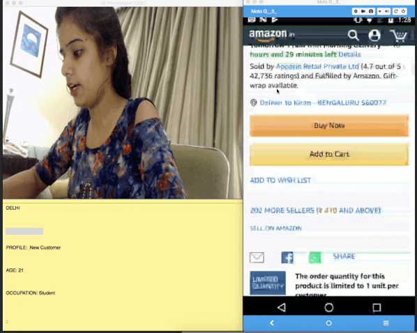
Based on our research studies, the core problem was clear. Product information was spread across the detail page, making it exceptionally long. Customers had no option but to scroll through the whole thing without knowing how deep it went, and reaching a specific section meant scrolling all the way to it.

A moderated customer research session: a participant on a video call beside a screen-share of the Amazon mobile detail page

Along the way, important sections went unnoticed, making it harder to arrive at a purchase decision.

Understanding the problem

We mapped the detail page, fold by fold

Before proposing any interface, we needed to see the detail page the way customers actually experience it. We pulled the real page apart, then mapped every section and how they relate.

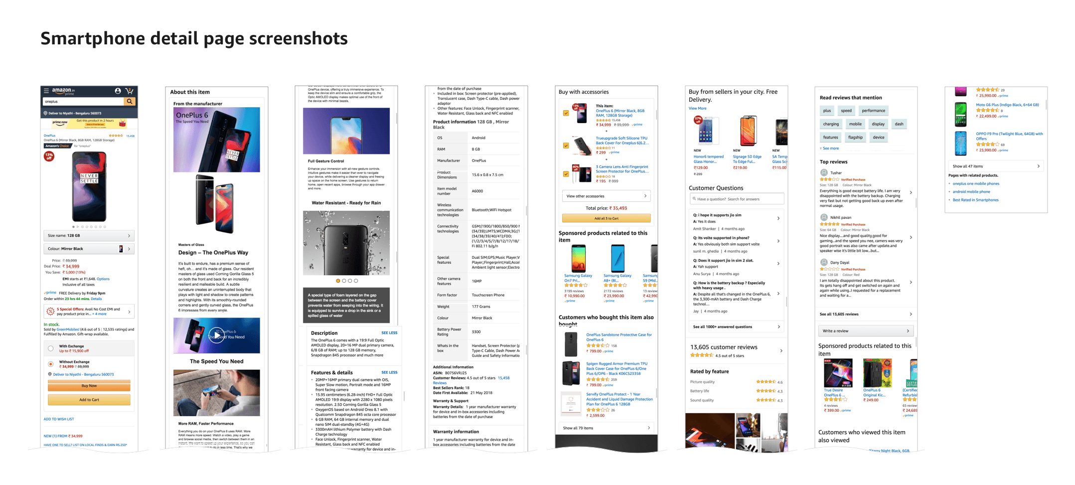
A typical smartphone product detail page laid out end to end, section by section
01The evidence

A typical detail page for an electronic item runs about 17 folds, product information, customer reviews, questions, similar products and sponsored items, all stacked into a single scroll. (As of Q1 2020.)

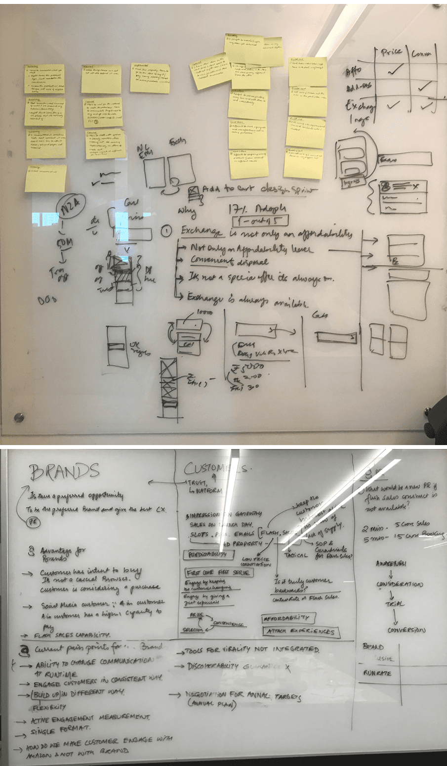
Whiteboard mapping the sections of the product detail page
02Mapping

We broke the page into its sections and mapped how they relate, looking for the moments that actually move a customer toward a decision.

Whiteboard grouping the most decision-relevant sections of the detail page
03Grouping

Drawing on past research, we identified product information, reviews, comparison and Q&A as the sections that matter most, and grouped them apart from lower-value content.

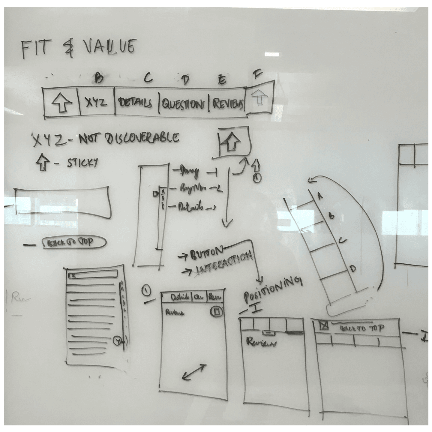
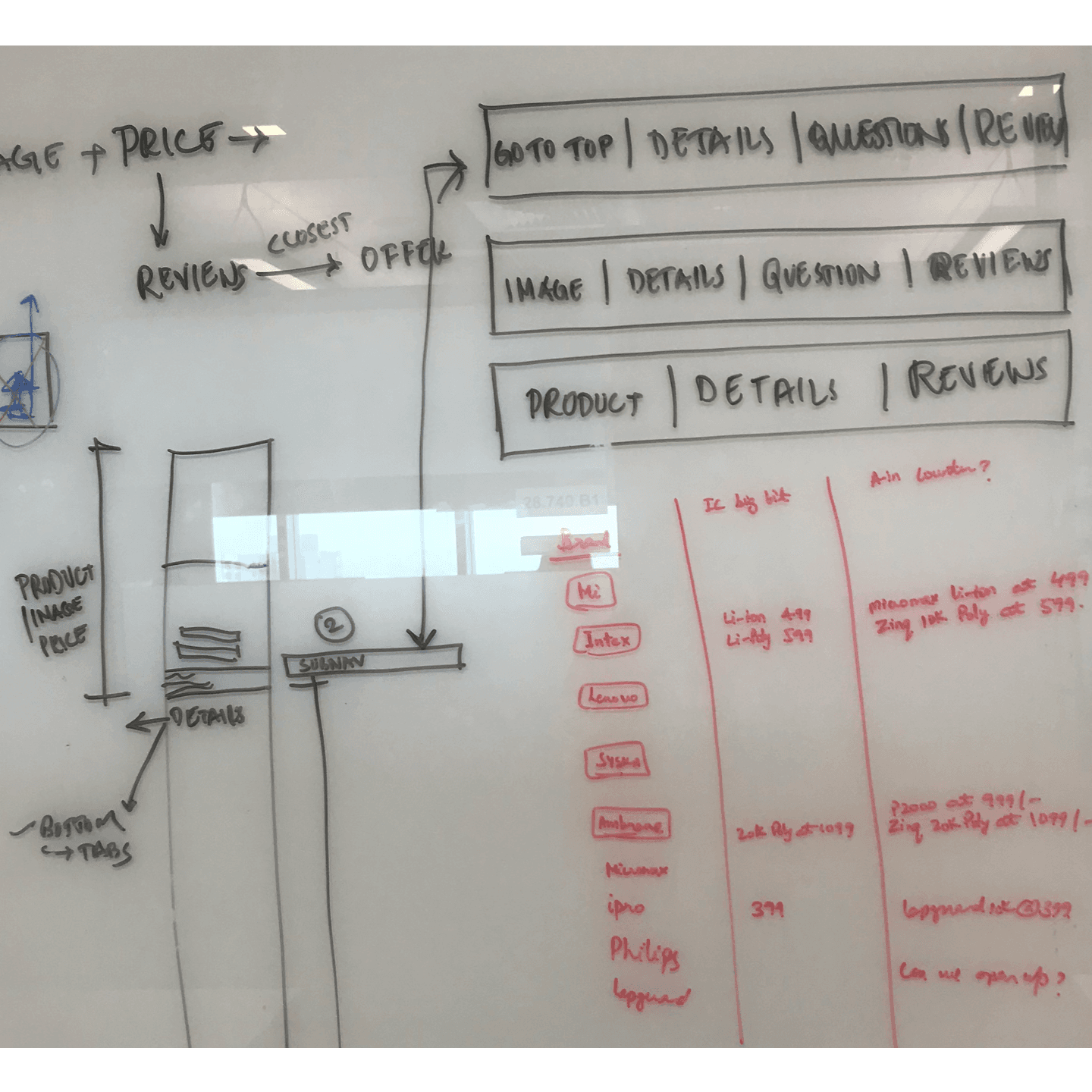
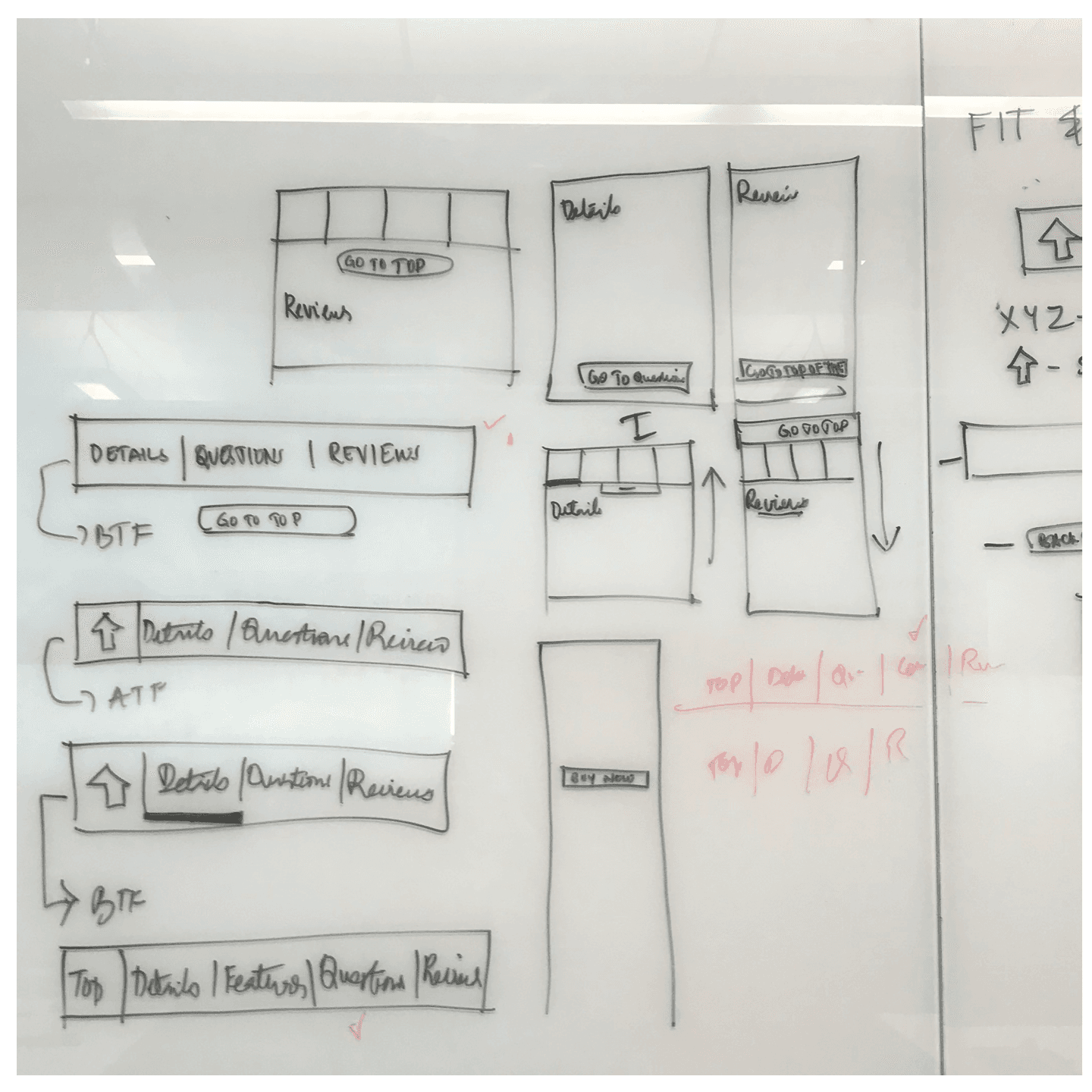
Whiteboard sketching a contextual sub-navigation that links to the grouped sections
04The core idea

From this session came the product's core idea.

A contextual sub-navigation: link customers straight to the decision-relevant sections instead of asking them to scroll the whole page to find them.

Design & iteration

Three experiments toward one sub-navigation

We shipped the idea as a contextual sub-navigation that links customers straight to the most decision-relevant sections of the page, then iterated it across three experiments.

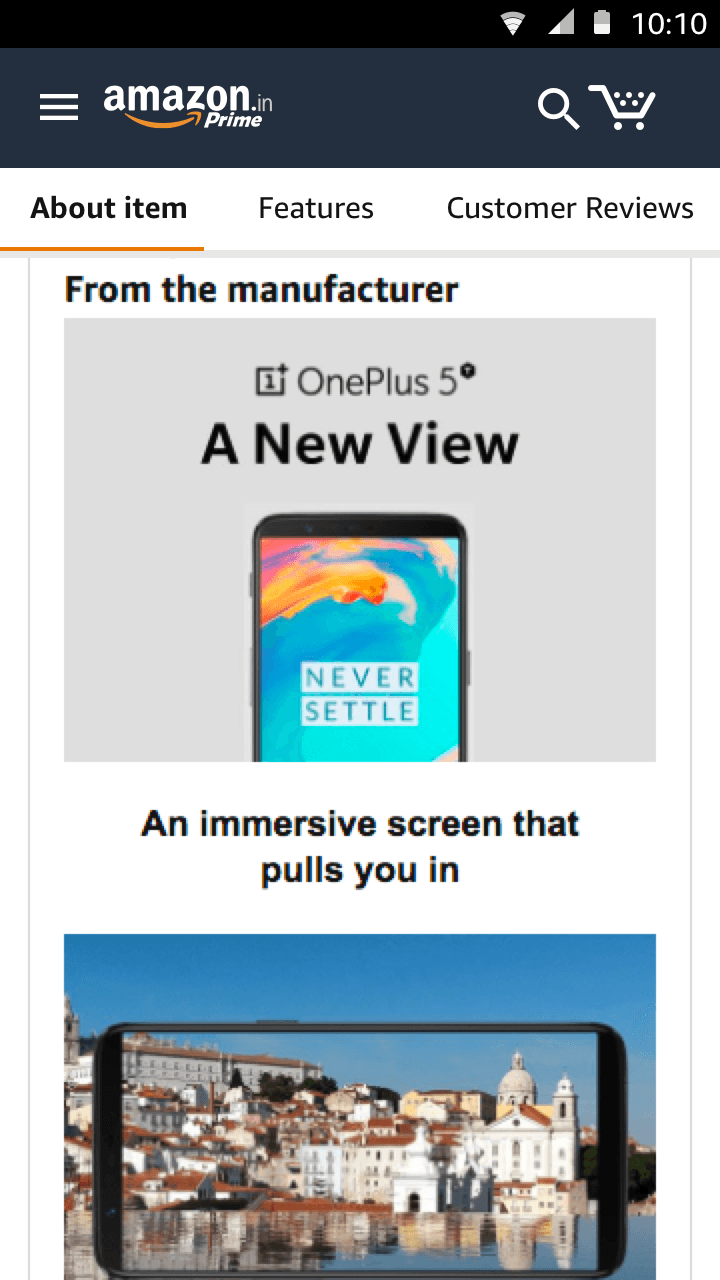
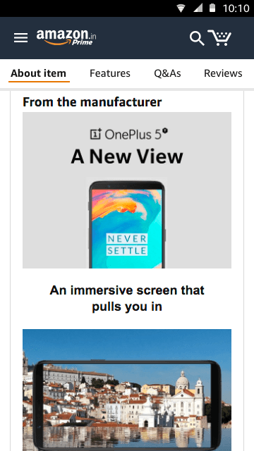
Experiment 1, the mobile detail page with a contextual sub-navigation across the top
01Experiment

A contextual sub-navigation

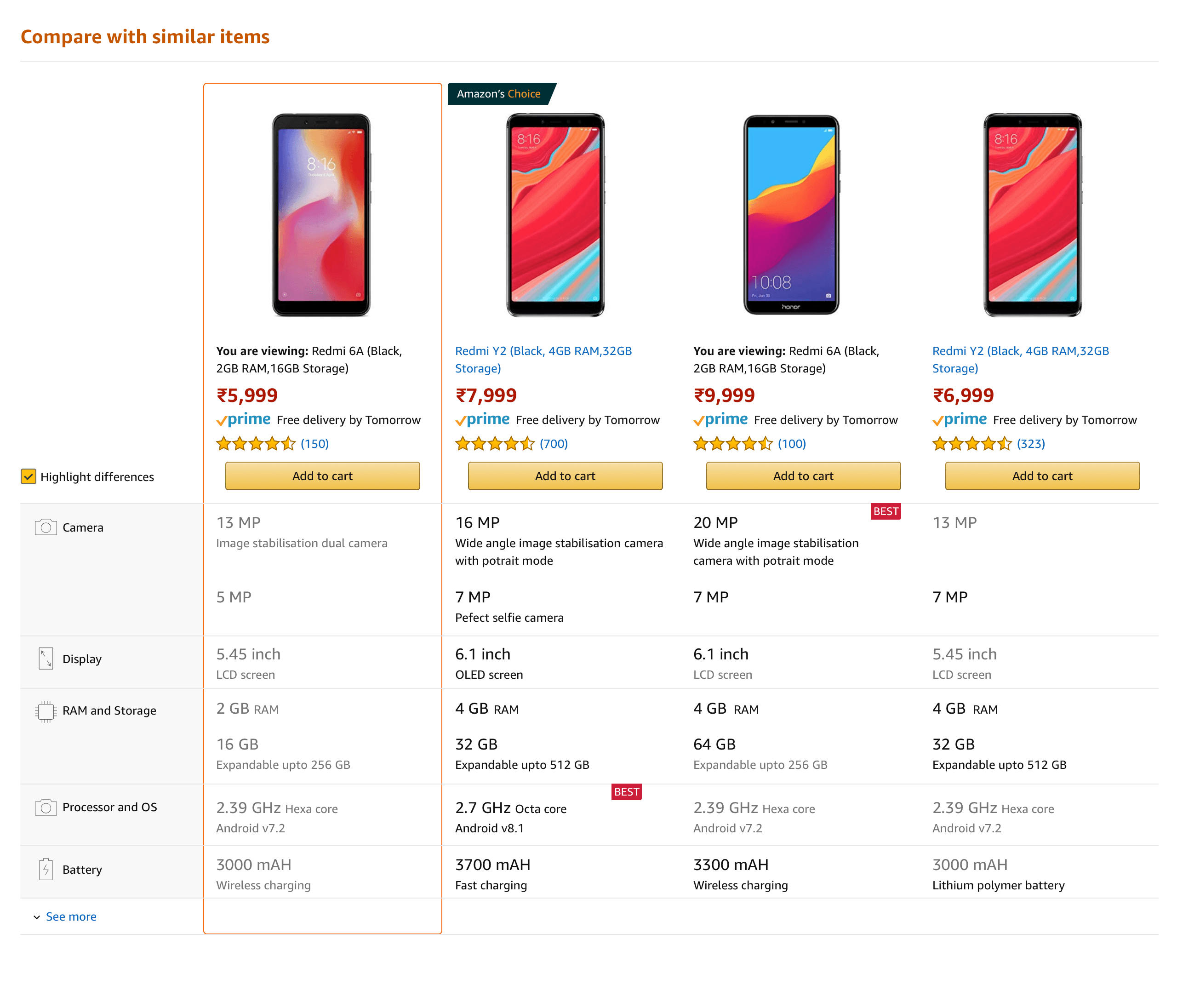
A new inline sub-navigation let customers jump straight to the most relevant sections of the detail page. Drawing on past research, we grouped product information, reviews, comparison and Q&A, the sections that matter most to someone making a purchase decision.

Grouping those sections together created a more seamless journey, while lower-value content like similar products sat further down. This first experiment tested that grouping.

Experiment 2, a refined sub-navigation with clearer section grouping
02Experiment

Refining the grouping

We iterated on the visual experience and tightened the grouping from Experiment 1, adding a clearer section bar and folding the Q&A section into the sub-navigation.

Experiment 2 showed a stronger, more consistent positive signal than Experiment 1.

Lift in conversion
More engagement with related products
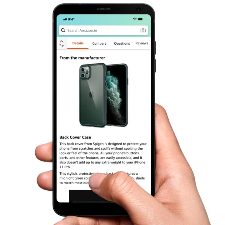
Experiment 3, a customer holding a phone showing the sticky sub-navigation on the detail page
03Experiment

A sticky sub-navigation

In the third iteration we moved the interaction into a sticky container. The sub-navigation docks just under the header and appears as the product details come into view, so it's there the moment customers need it.

The final design docks into a compact bar, Details, Compare, Questions, Reviews, with a persistent “Back to top” action. It first shipped in October 2020 and was reused again in July 2021.
Reflections & learnings

What I took away

Page length is a moving target.

The detail page changes length constantly, so an interaction anchored to it has to stay robust as sections appear, grow and disappear. A lot of the design work was handling those shifts gracefully.

Small screens raised the stakes.

What felt comfortable on a larger screen could crowd a smaller one. Designing the sub-navigation to hold up across device sizes was one of the harder constraints.

A long project tests conviction.

This was a long-running effort with real uncertainty along the way. Staying close to the customer problem, and pushing back when it mattered, is what kept the work honest, and it shipped across India, the EU and other marketplaces.

On a page that never stops growing, the best thing you can do for a shopper is help them get straight to what matters.