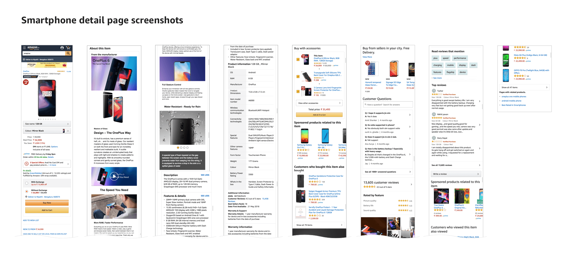
Selected work

Product comparison

Year
2019–2020
Role
Product Designer

Helping shoppers weigh similar products side by side, without leaving the product they came to see.

Overview

It's 2019, and consumer electronics is booming. But buying online still means wandering across multiple websites to research a product before committing, because the specs on the page are written in technical jargon most shoppers can't parse on their own.

On Amazon's product detail page, that decision lived in a feature called “Compare with similar items.” In practice it worked against the decision more than it helped it, surfacing products that weren't really comparable, buried in dense, jargon-heavy tables.

This is the story of picking up that existing experience and reworking it into something a shopper can actually read: the right products, the specs that matter, in plain language, with the product they came to see always in view.
The customer problem

Comparison should make a decision easier. This one made it harder.

Think about buying an electronic product in a store. You're guided by a knowledgeable salesperson, in a structured, human way that helps you decide. Online, that assistance disappears, and without an immersive way to evaluate products, shoppers hesitate on exactly the high-consideration purchases that matter most.

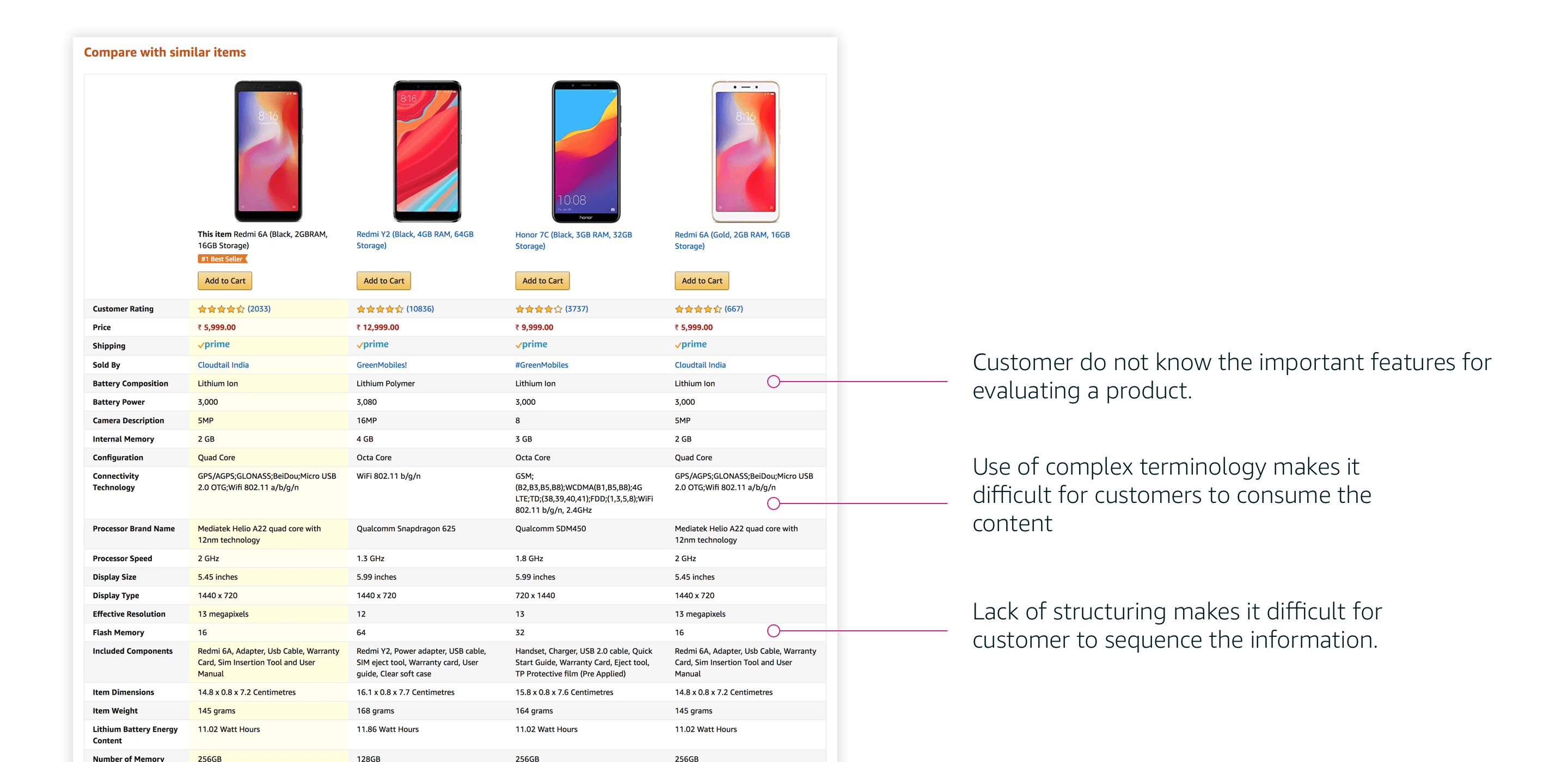
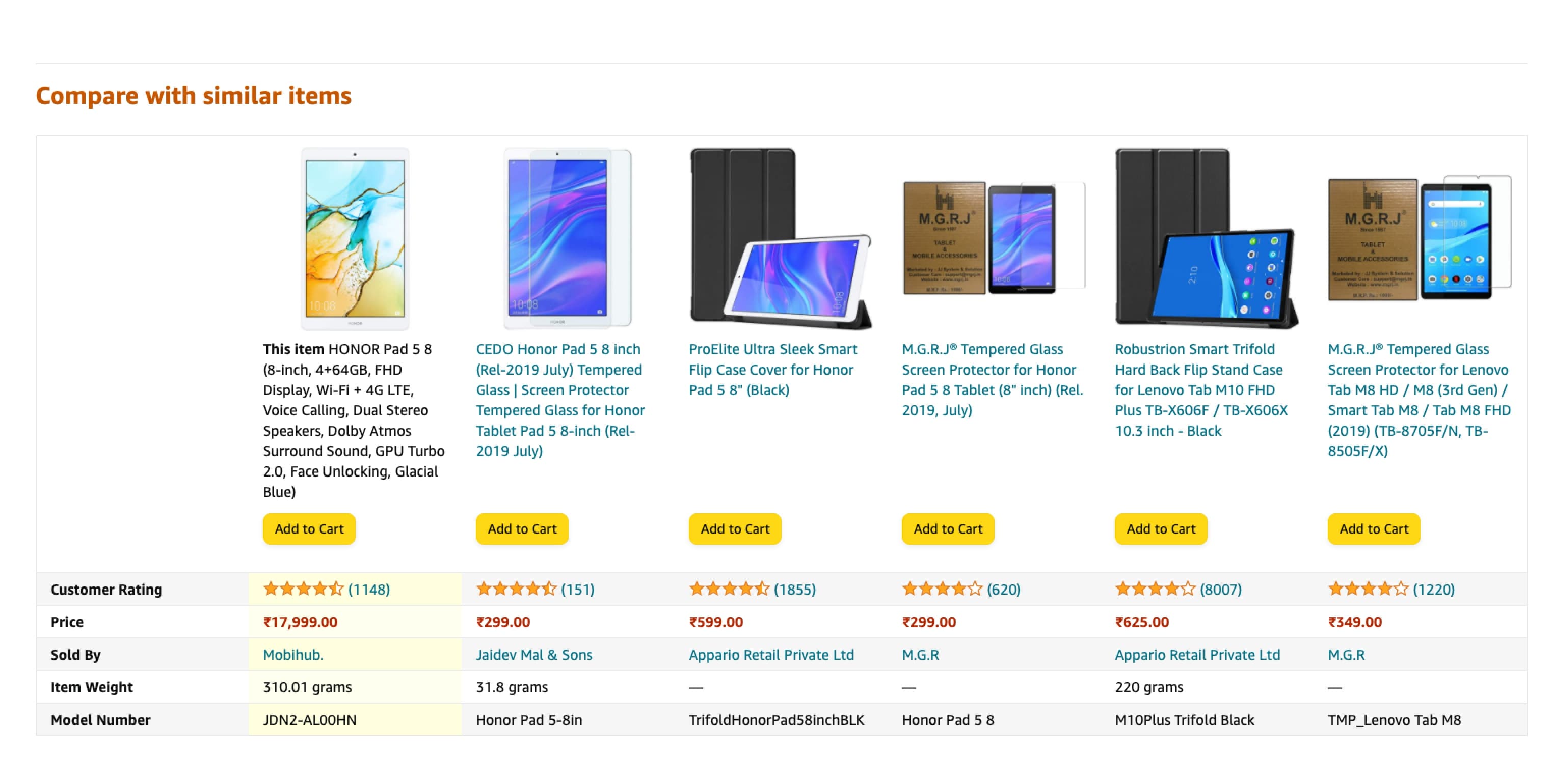
The “Compare with similar items” module was meant to bridge that gap. Instead it often lined a phone up against phone cases and screen protectors, same category, but nothing a shopper could meaningfully weigh. And when the products were comparable, the table itself got in the way: dozens of rows of raw specs, dense terminology, and no structure to signal which differences actually mattered.

So the feature meant to build confidence quietly eroded it.

My role

Product Designer

I led the design end to end, from reframing what “similar” should even mean, through concept and interaction, to validating the treatments with real customers.

What I did

  • Customer research
  • Interaction design
  • Prototyping
  • Usability testing
  • Content & copy
  • Cross-team collaboration

Understanding the problem

We listened to how people actually compare

Most comparison tables online are built for people who are already tech-savvy. Amazon’s own tables carried limited information, so shoppers left to compare somewhere else.

Apart from shopping sites, I get good comparative analysis on a lot of other websites. I often use sites like GSM Arena to compare different mobile models.

Customer, Prime Day ’19 research

The old experience

We pulled the old comparison apart

Before proposing anything new, we looked closely at how the existing module behaved on a real product page, what it surfaced, and why customers couldn't get anything out of it.

01The module, as it was

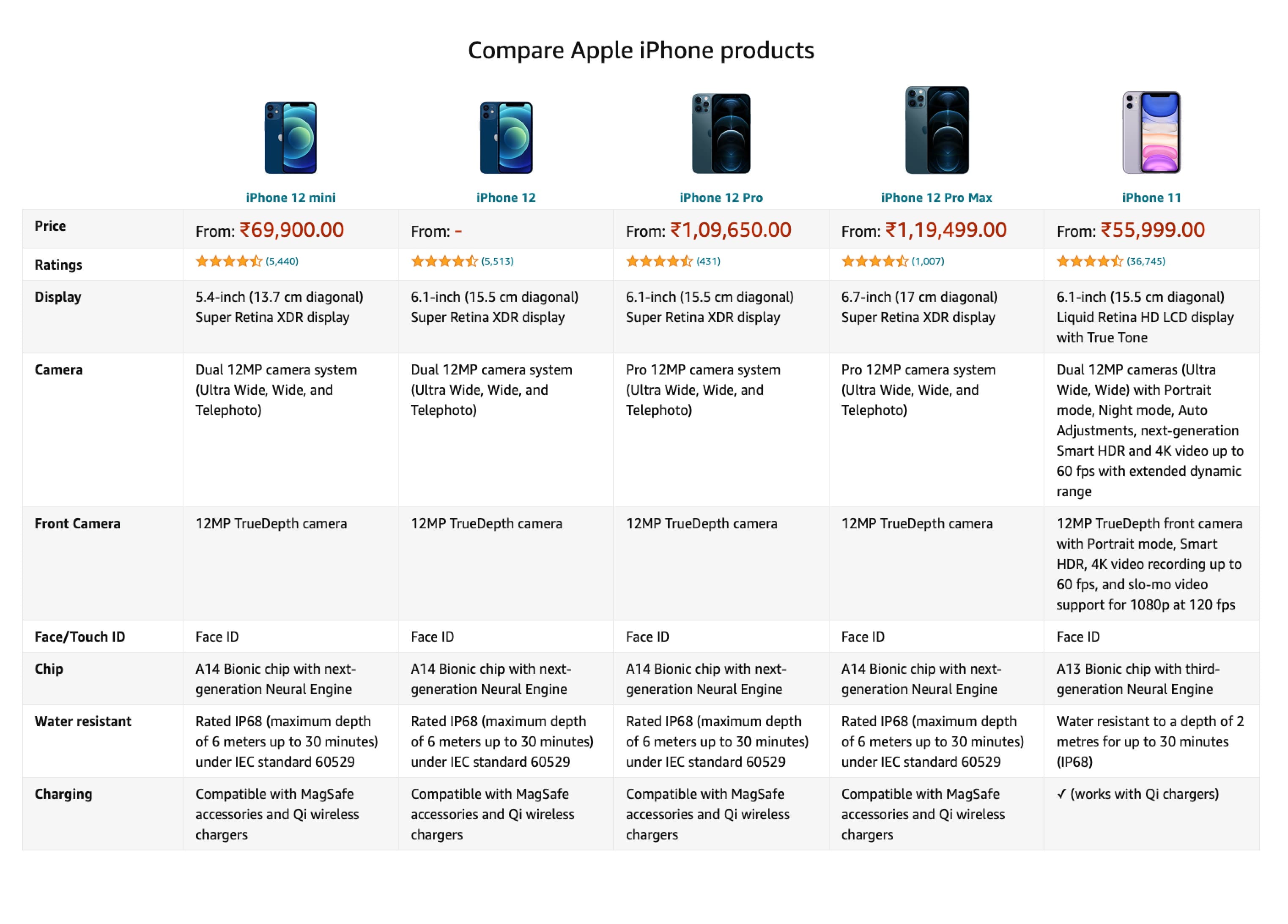
This is “Compare with similar items” as customers met it, a flat grid of raw specs. Even when the products were genuinely comparable, dense terminology and no visual hierarchy left shoppers with no signal for which differences actually mattered.

The existing “Compare with similar items” table lining up five iPhone models against a long list of raw specifications
The old “Compare with similar items” table comparing a tablet against cases and screen protectors
02Irrelevant matches

The module frequently compared a product against accessories for it, a tablet lined up against its own cases and screen protectors. Same category, but nothing a shopper could weigh one option against another.

Three frustrations

Three frustrations surfaced again and again

The dense specification table annotated with three recurring customer frustrations

Even for genuinely comparable products, three problems came up again and again: customers didn't know which features actually mattered, the terminology was too technical to parse, and there was no structure to help them sequence the information.

Key design decisions

Four decisions that reshaped the comparison

Each decision targeted one of those frustrations directly, turning a raw data dump into a comparison a shopper can read, reason about, and act on.

01Group by meaning

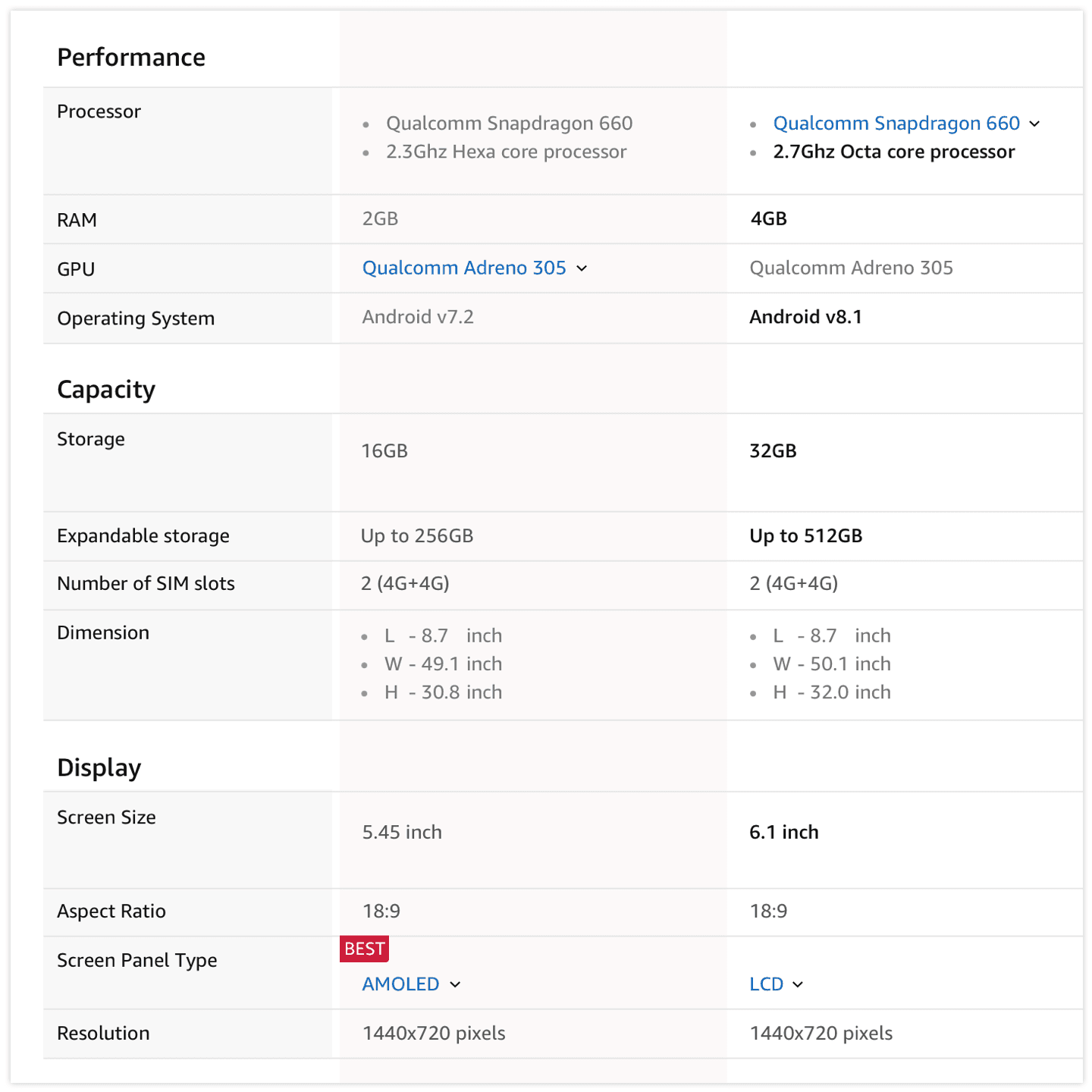
Related attributes are grouped into meaningful sections, Performance, Capacity, Display, instead of one long undifferentiated list, and the strongest value in each row is called out, so the differences that matter surface on their own.

Specifications grouped into Performance, Capacity and Display sections with the best value marked
02

Key features, upfront

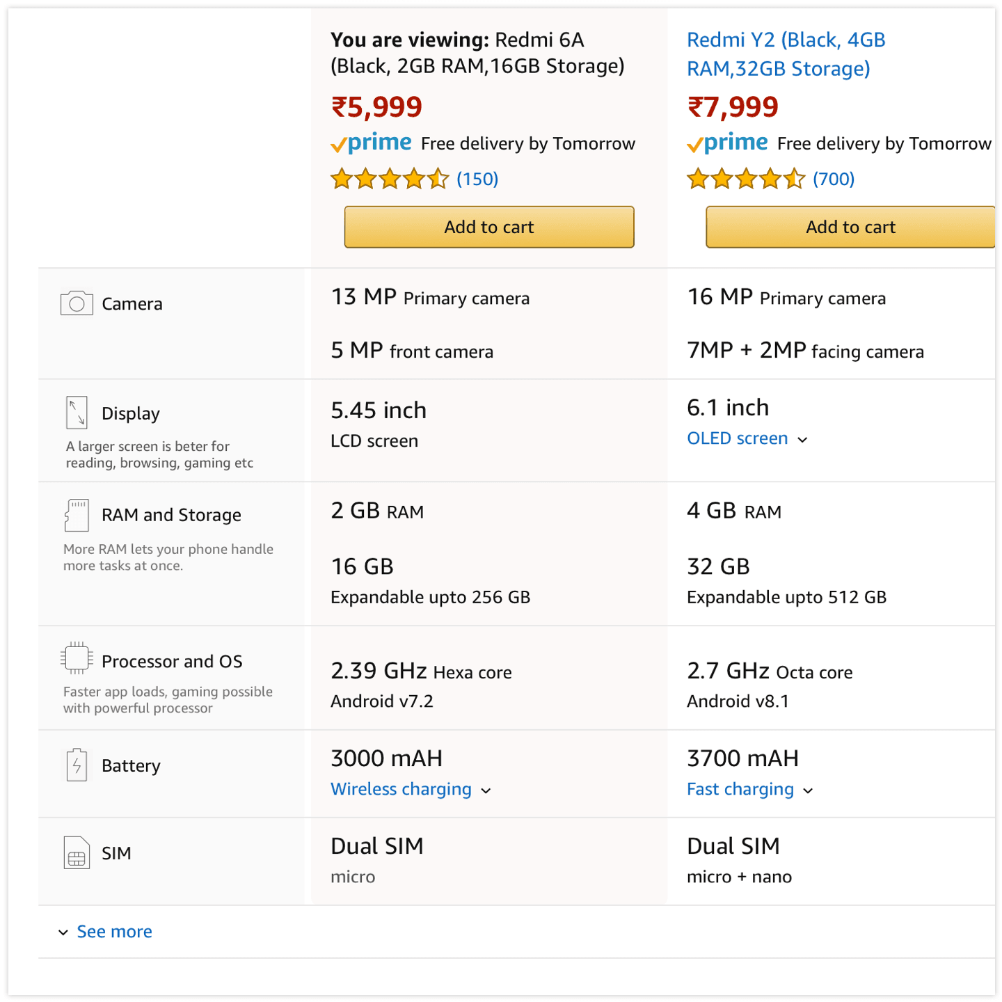
Every category has 5–7 features shoppers actually care about, RAM, camera, display for a phone; processor, screen, graphics for a laptop. These are surfaced first, each with an icon and label, so the comparison starts with what matters most.

A phone comparison surfacing key features first, camera, display, RAM, each with an icon and a short description
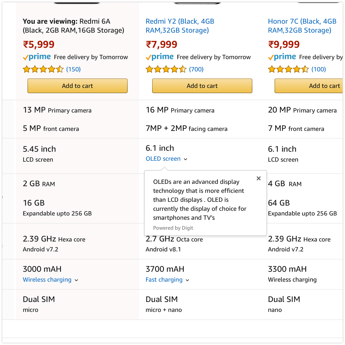
A plain-language popover explaining what an OLED display is
03Plain language

Feature titles carry short, plain-language descriptions, and technically complex terms get a popover that explains them, what an OLED display is, why it matters, so no prior knowledge is needed to compare.

04

Retain context

When the table expands it often scrolls past the viewport. A sticky header keeps the base products pinned in view, so every comparison is still read against the product the customer came to see.

The redesigned comparison keeping the product the customer is viewing anchored as a sticky reference

Final solution

A comparison a shopper can actually read

The reworked comparison keeps the product you came to see in context and lines it up only against options you can genuinely weigh it against.

Only the key attributes show upfront, so no one is overwhelmed; the full set is a tap away, grouped by theme. Meaningful differences are surfaced instead of buried, and the technical language is translated as you read.

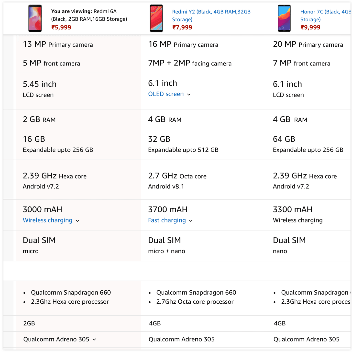
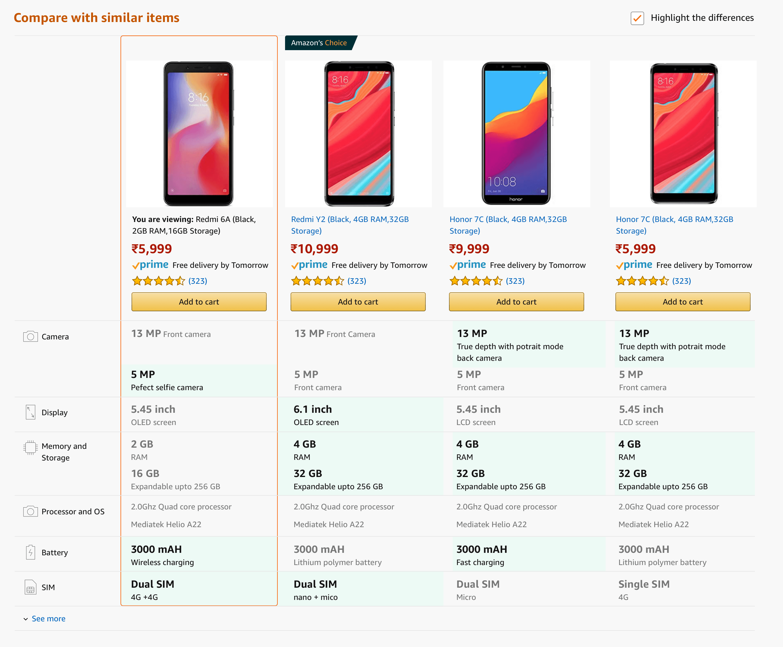
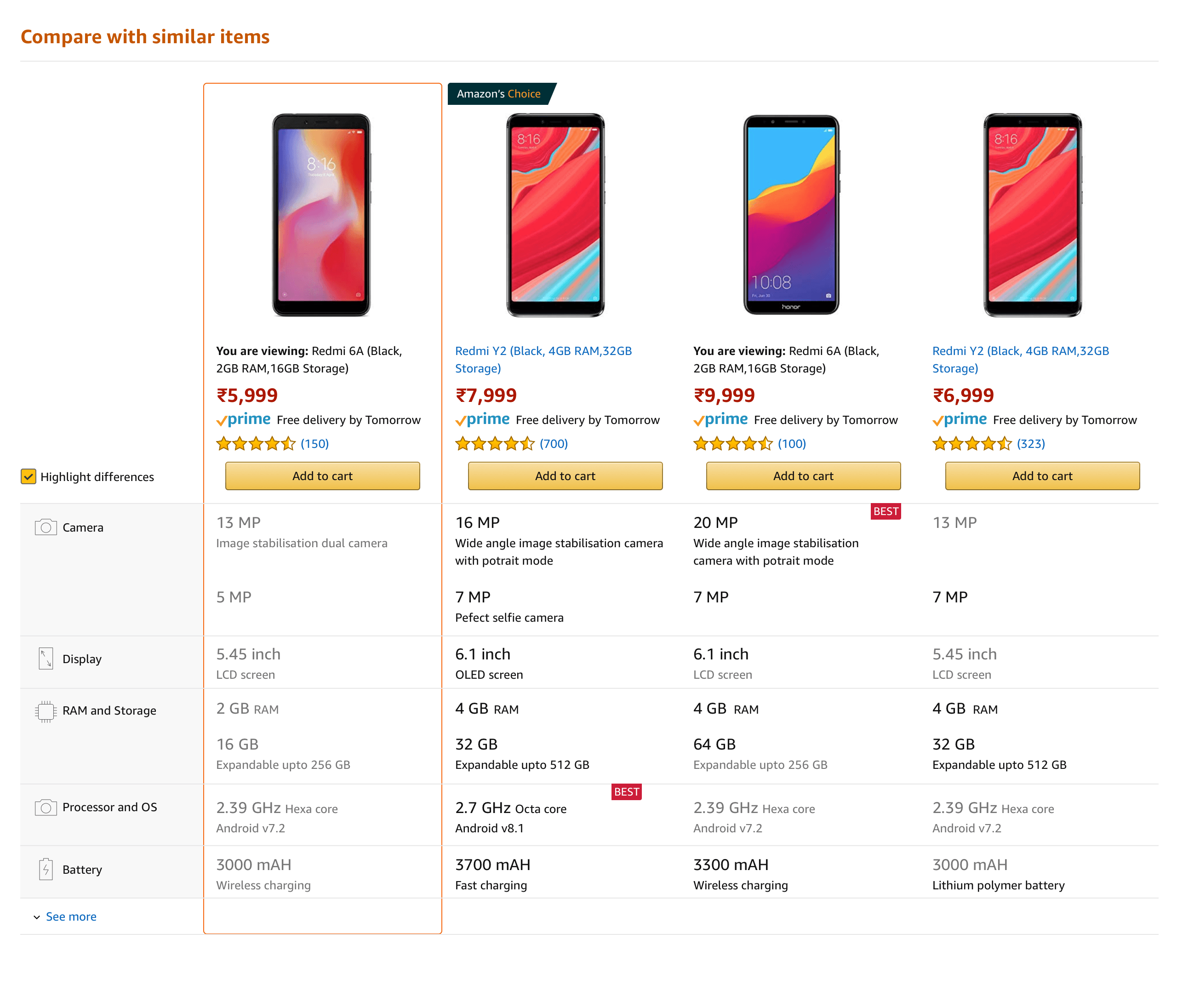
The relaunched Compare with similar items, grouped specs, the best value in each row marked, and differences highlighted

What changed

Your product stays in context

A sticky reference column anchors the item the customer is viewing, so every comparison reads against something familiar rather than a blank, contextless table.

Grouped, scannable specs

Raw rows became meaningful groups, with the strongest value in each row marked and a highlight-differences control that fades out what's identical.

Only what matters, on demand

Key features lead; the full attribute list is available via “see more,” grouped by theme, and inline explanations translate the jargon in place.

Impact

A long-standing frustration, closed.

The relaunch improved the comparison feature's metrics across the board and resolved a comparison pain point customers had lived with for years on Amazon India.

The relaunched Compare with similar items in market, key specs surfaced, the strongest value in each row flagged as BEST, and differences highlighted, with the product being viewed pinned in context

Comparable, not just “similar.”

Shoppers now see genuine alternatives they can weigh against each other, instead of a product lined up against its own cases and screen protectors.

Readable without prior knowledge.

Grouped specs, highlighted differences, and plain-language explanations let anyone compare in place, without leaving to research the jargon elsewhere.

Comparison CX launched in India and the US.

In testing

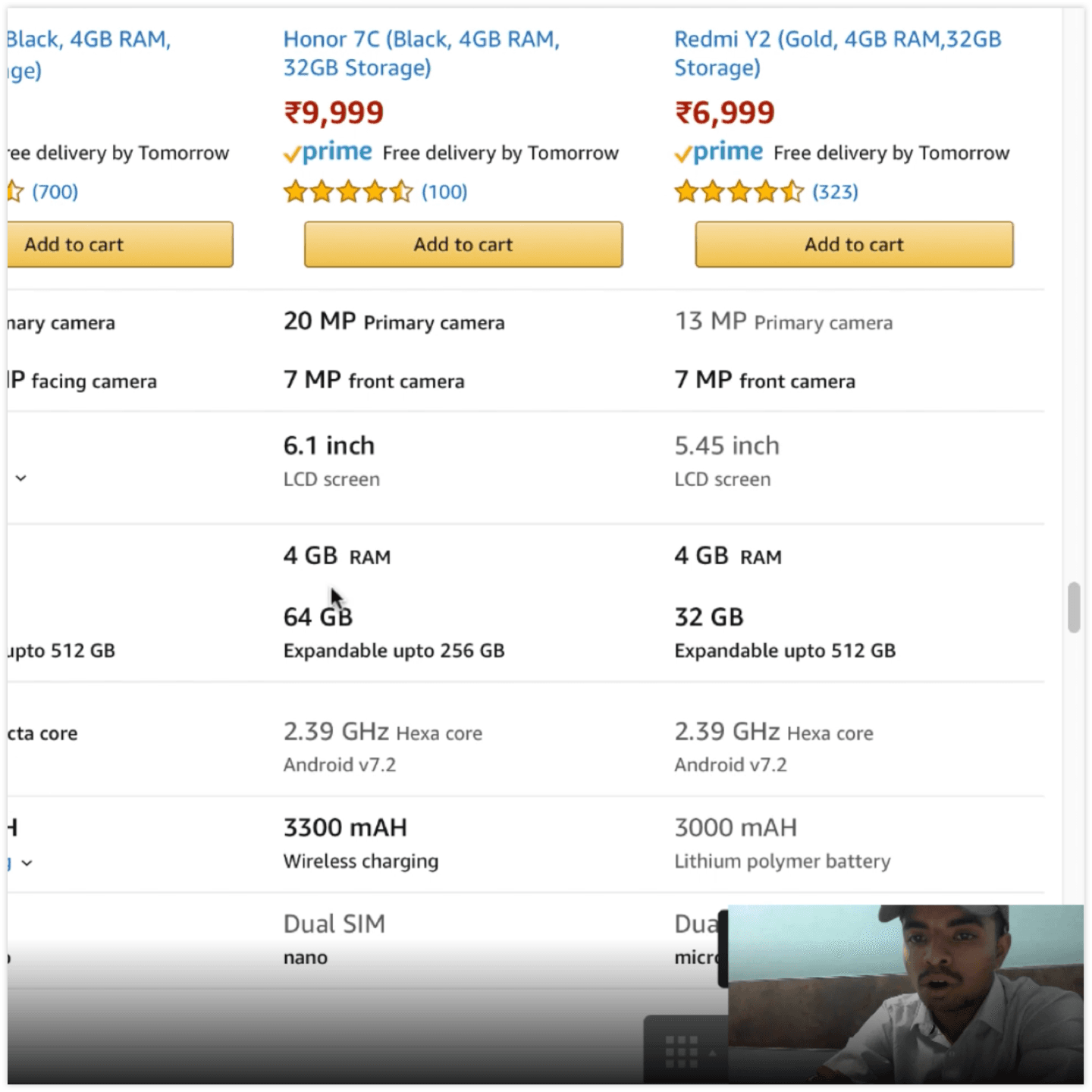
The treatments went in front of real customers before they ever shipped, where the most important learning of the project surfaced.

A comparison table under review during a usability test, with the participant recorded in the corner
Usability

During comparison usability testing.

Reflections & learnings

What I took away

“Similar” is a design decision, not a data query.

The most damaging problem wasn't the table, it was comparing products that couldn't be compared. Deciding what counts as a genuine alternative mattered more to the experience than any layout choice we made afterwards.

Structure is what turns data into a decision.

The specs were always there. Grouping them, highlighting the differences, and marking the strongest values is what let customers reason about the information instead of just reading it.

Validation saved the project.

Early on I leaned on typography alone to communicate differences. Reviewing it internally produced feedback but no clear answer, so we took the treatments to customers. They didn't read them the way we intended, and even confused them for other experiences. Without that validation, the whole approach would have shipped and quietly failed.

A good comparison doesn't just show the specs. It tells you what they mean for your choice.