CloudWatch Visualization Studio
- Year
- Role
A unified workspace for exploring, querying, visualizing, and sharing telemetry across AWS and third-party data sources.
A unified workspace for exploring, querying, visualizing, and sharing telemetry across AWS and third-party data sources.
The Challenge
Modern systems generate millions of telemetry signals every day. CloudWatch helped engineers collect that data, but understanding it wasn't easy.
Before
As CloudWatch grew, the metrics experience became fragmented. Engineers moved between multiple tabs, repeatedly searched for the same metrics, manually correlated information, and constantly switched context.
The challenge wasn't designing another feature. It was making one of AWS's core observability experiences feel like a single, connected workspace.
My role
I led the end-to-end UX across two phases of the project.
What I did
Understanding the problem
We started by listening to the people who live inside these metrics every day.
Four themes emerged
Discovery
Workflow
Usability
Reliability
The components weren't broken. The workflow was.
Understanding the workflow
Customer
We followed a single engineer through one investigation, and watched a simple question turn into a dozen detours.
What we observed
Too many navigation steps
Repeated searches
Manual correlation
Context switching
Understanding the query
Before designing any interface, we needed to understand the anatomy of a query itself. In this brainstorming session, we broke down every parameter that goes into building a metric query and mapped out how they relate to each other.
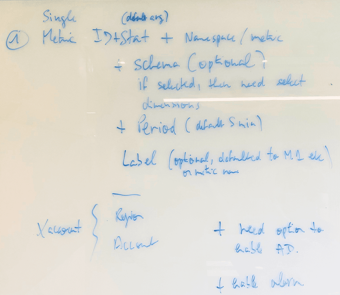
We broke a query into its parts (metric ID, stat, namespace, schema, period, label, and account) and noted which were optional, which had defaults, and which unlocked further choices.
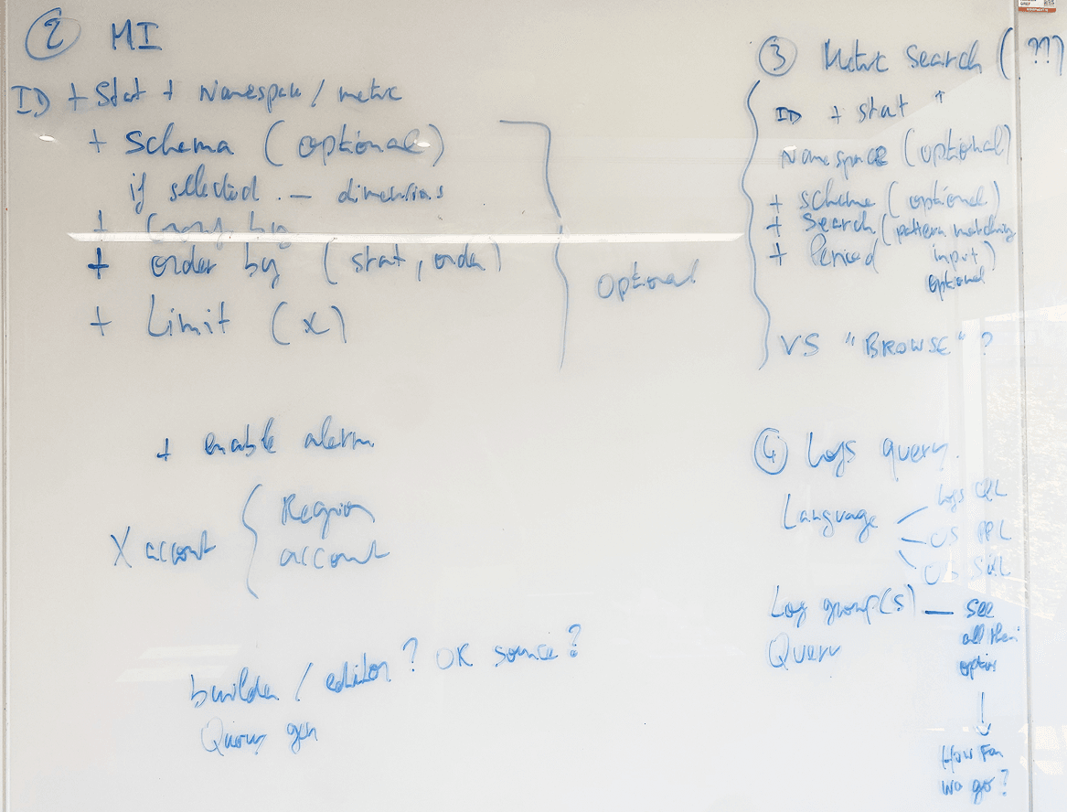
We sketched single vs. mixed query types, how modules and namespaces interact, what happens when a schema is optional vs. required, how label selection cascades into keyword filtering, and what state each element can be in.
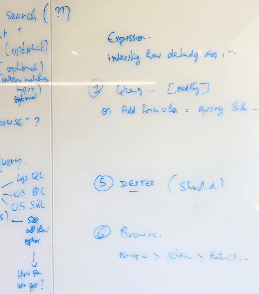
Progressive disclosure in the final builder, from builder mode to code mode, came straight from this session. Not every parameter matters to every user at every moment, and the UI needed to reflect that hierarchy.
Key design decisions
Previously, finding a metric, building a query, and editing it were spread across separate tabs. Context was lost at every switch. The structure made a simple task feel like three disconnected tasks.
I redesigned this into a single unified query widget with multiple modes: namespace browse, guided builder, and code editor. All modes live in the same space and feed into the same output graph. Pick a metric from the browser and the query starts forming; switch to editor mode to refine it.
Engineers don't think in tabs. They think in questions. “What is causing errors” is one thought, and the interface should treat it as one continuous action, not three separate steps scattered across the page.
The query builder needed to serve two purposes: deep exploration when discovering what's available, and staying out of the way when you already know what you want.
I designed it as a collapsible panel with a hierarchical view of namespaces, metrics, labels, and values when expanded. When collapsed, it gives full space back to the editor and results. Users can also switch to a flat list mode for faster scanning when they know roughly what they're looking for.
Screen real estate in analytics tools is precious. The query builder should be powerful when needed and invisible when not.
Builder mode
Code mode
1 avg(
2   CPUUtilization
3 ) by (InstanceId)
The same query, carried across
Not every user is comfortable writing PromQL from scratch. But advanced users don't want to be slowed down by a form-based interface either. I designed a two-mode query editor. Builder mode offers a guided experience where selecting a metric, labels, and values visually constructs the query. When users are ready for more power, they switch to Code mode and the query carries over, so they keep building from where they left off, now with full syntax control and auto-complete.
This respects different skill levels without creating two separate products. Beginners learn by watching their selections turn into real queries. Advanced users skip straight to code. Everyone gets what they need.
Instead of building separate interfaces for each data source (metrics, logs, traces, CloudTrail), I advocated for one query workspace where users select their source and the interface adapts. Same layout, same interaction patterns, different query syntax under the hood. A middleware layer normalizes responses from different APIs so the visualization layer receives everything in a consistent format. Users learn one mental model and apply it everywhere.
Normalization middleware
different APIs → one consistent format
One query workspace
One mental model, every source
Why this matters
Users shouldn't need to relearn the interface every time they switch data sources. This is what competitors like Grafana got right, and what CloudWatch was missing.
Final solution
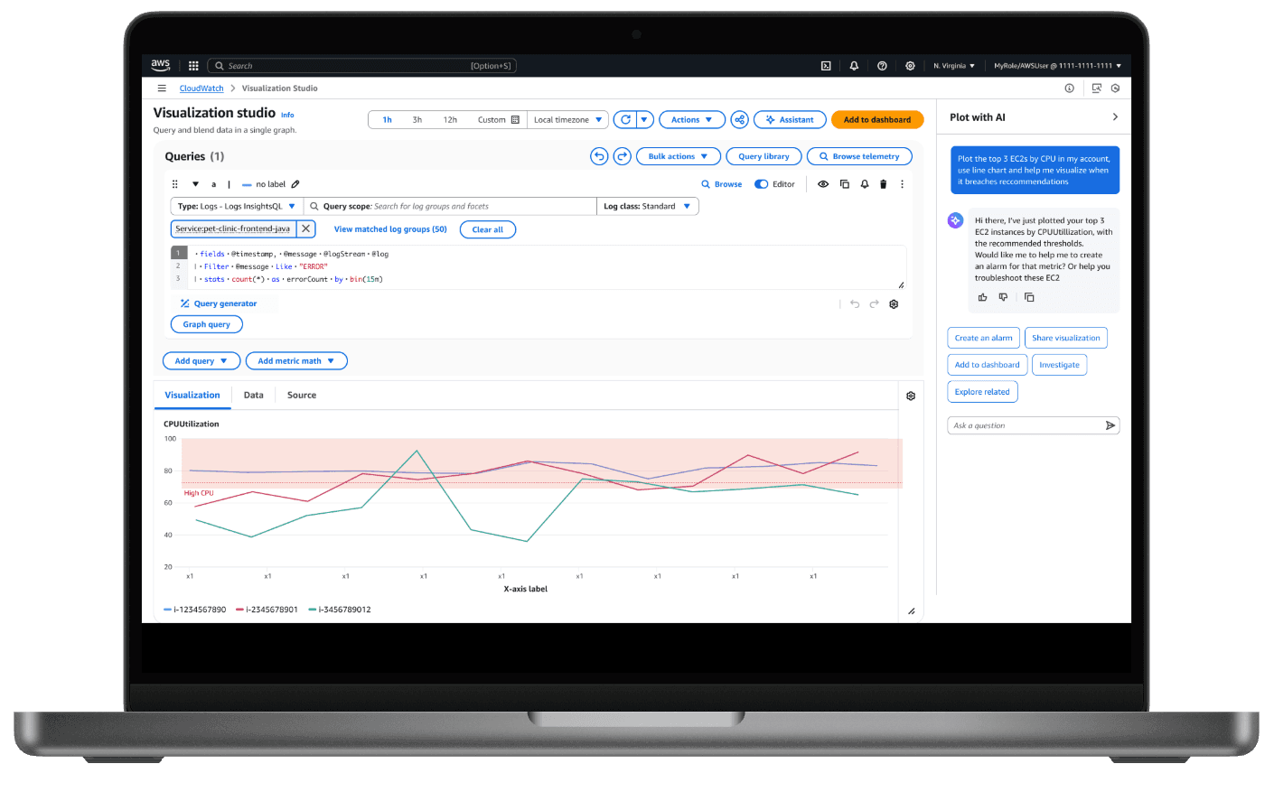
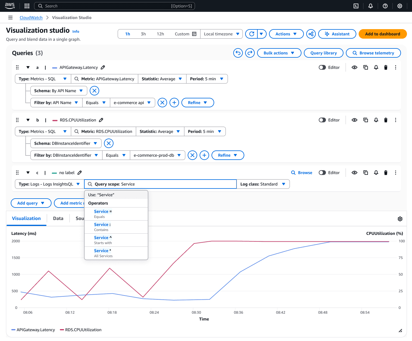
Visualization Studio is a unified workspace where engineers can query, visualize, and analyze data from any AWS service without leaving a single interface.
The interface is organized around a natural top-to-bottom flow. Queries are built at the top using builder or editor mode. The visualization renders directly below, updating in real time as queries are refined. A standalone AI panel sits on the right, offering intelligent suggestions and natural language query generation. Everything stays in view on a single page.
The unified workspace in action: querying, visualizing, and refining on a single page.
What's inside
Two modes that work together. Builder mode walks users through metric selection step by step, forming the query visually in real time. Code mode gives full control with auto-complete and syntax validation. Switching between them carries the query over, so users never lose their work.
Users can run multiple parallel queries and compare results across data sources live.
We went from 8 basic chart types to over 40 through Highcharts integration, each with deep customization: color palettes, legend positioning, multi-axis support, annotations, and threshold bands. For power users who need something beyond the standard library, we added Vega support with full declarative control over visualization design.
Users can save queries into collections, add visualizations directly to dashboards, share deep links that preserve the full configuration, and let teammates build on existing work.
Outcomes & impact
Instead of jumping between four consoles during an incident, they had one workspace that connected metrics, logs, traces, and events together.
Business analysts and DevOps managers who previously couldn't navigate multiple query languages could now use builder mode or ask Amazon Q in plain language.
Deep links meant an engineer could share their exact view with a teammate. Saved queries meant common investigations didn't need to be rebuilt from scratch every time.
Visualization Studio directly addressed the top reason enterprise customers were choosing Grafana and Datadog over CloudWatch. By closing the visualization and experience gap, CloudWatch became a viable single-pane observability solution for organizations that previously needed third-party tools to fill the gaps.
Reflections & learnings
This project touched 8+ data sources, 40+ visualization types, multiple query languages, and two very different user personas. The hardest part wasn't adding features. It was making all of it feel like one simple, coherent experience. I think we got that right.
The builder-to-code-mode flow wasn't just a nice idea on paper. It genuinely bridged the gap between beginners and power users without dumbing things down or creating two separate products.
Going from concept to GA in 8 months on a project this complex required constant prioritization. I learned to fight for the interactions that mattered most and let go of the ones that could come later.
Building for observability taught me that speed isn't just a nice-to-have. When your users are debugging production incidents at 2 AM, every extra click is a cost. That urgency shaped every decision I made, and made me a sharper, more intentional designer.