Design challenge for health tech
- Year
- Role
Introducing therapy with a calmer, guided path from uncertainty to a first conversation.

Introducing therapy with a calmer, guided path from uncertainty to a first conversation.
The opportunity
Launching therapy in a new market meant designing for people who might not know what therapy is, what to expect, or who to choose.
Alan already made healthcare feel accessible, but a therapy offer asks for a different kind of confidence. First-time seekers can arrive at a vulnerable moment and still face an unfamiliar list of specialists, clinical language and a high-commitment decision.
The feature needed to introduce the service, help members recognise what they wanted support with, and offer a useful recommendation without turning the journey into a medical assessment.
The product principle was simple: after someone decides to ask for help, the experience should not ask them to make another difficult decision alone.
My role
An independent one-week design challenge covering the service proposition, experience architecture, visual system, interactive prototype and implementation-ready specification.
What I did
The product
Rather than dropping members into therapist browsing, the experience creates a progressive path: understand the offer, express a need in everyday language, get human guidance and move into booking with context.
01A soft-launch proposition
Start small enough to learn, but complete enough to earn trust.
The soft launch introduces therapy as a benefit inside a familiar healthcare product. It avoids asking members to self-diagnose and offers two valid paths: browse independently or get help choosing.
A short orientation call gives the matching process a human layer. The resulting recommendation explains why a therapist fits, retains member choice and leads directly into the existing booking journey.
Design decision
Use a human-assisted recommendation as a confidence bridge. The service does the difficult sorting while the member keeps the final decision.
02Progressive commitment
Each step answers one concern before asking for the next commitment.
The journey begins with familiar life concerns rather than specialisms. Members can then choose a therapist directly or book a 15-minute guidance call, review the time, receive confirmation and return later to a clearly explained recommendation.
The sequence deliberately separates choosing support from committing to a full therapy session. That makes the first action smaller and gives Alan room to learn where members hesitate during the market launch.
03Delivery in parallel
The interface and its implementation contract were designed together.
The prototype was built as the experience was refined, so interaction details were tested in a working flow rather than documented as static intentions. Reusable controls, booking states and recommendation patterns were treated as a small feature library from the start.
The handoff package is structured around shared tokens, repeatable component states, annotated behaviour and a working reference prototype. This gives engineering one coherent source for both appearance and interaction.
Key product moment
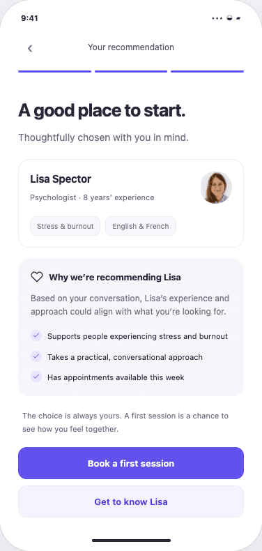
The experience does not simply announce a match. It introduces the therapist, connects the recommendation to what the member shared, and keeps the choice reversible. That transparency turns guidance into confidence.
Clear matching rationale
Relevant experience
Book or keep exploring
Interface system
The feature extends Alan’s friendly visual language with patterns for guided questions, transparent recommendations, booking states and reassurance. Tokens keep those decisions consistent in design and code.
Colour tokens
Ink
Primary
Support
Soft
Canvas
Success
Type scale
Display · 36 / 39
Title · 24 / 29
Body · 16 / 24
Selection pattern
Actions and feedback
Included in your Alan plan
A 15-minute orientation call comes at no extra cost.
Recommendations explain why a therapist fits, so guidance never feels like a black box.
Every step offers a clear escape route for members who are unsure or prefer to browse.
Semantic tokens and repeatable states create a shared contract between design and engineering.
Final experience
The final flow combines education, guided matching, a low-pressure orientation call and a transparent recommendation. The prototype covers the complete journey and its key interaction states.
The walkthrough is recorded directly from the working click-through prototype, including the guidance call, time selection, confirmation and final therapist recommendation.
What was delivered
The result is a coherent proposition, interface system and coded reference that can support a focused market test and evolve with real member behaviour.
The concept covers introduction, guided choice, scheduling, confirmation and a transparent recommendation.
Members can ask for help or browse independently, with both routes treated as first-class paths.
New patterns extend the existing product language for questions, guidance and therapist recommendations.
Tokens, component states and a working prototype reduce interpretation during engineering handoff.
Design principles
For a sensitive service, the first task is helping members understand what will happen and feel safe enough to continue.
A recommendation earns trust when the product explains the reasoning and keeps alternatives visible.
A focused service path creates clear points to measure hesitation, completion and the usefulness of a match before scaling.
The feature does more than find a therapist. It makes asking for help feel possible.