Selected work

Designing Observability platform

Year
2024–2025
Role
Lead UX Designer

for a Multi-Cloud, AI world

Overview

Observability was designed for static architectures and human operators. That model still works, it just no longer keeps pace. Workloads now span multiple cloud providers with no unified view. Agentic AI creates service topologies that change per-request, with no static diagram to fall back on. Scale has outrun human cognition. And the market has already moved.

CloudWatch Plus is AWS's response: a next-generation observability platform built for the era of agentic AI, multi-cloud complexity, and machine-speed operations.

Why proactive monitoring

Why proactive monitoring?

Traditional observability is reactive. Something breaks, an alert fires, a human opens a console, navigates to the right page, builds a query, interprets the result, and decides what to do. Every step is manual. Every transition is a context-switch.

CloudWatch Plus inverts this. The system watches continuously, triages what matters, and tells you what needs attention before you ask. When you do need to investigate, you don't navigate between pages, you open a session, and everything you need comes to you.

ReactiveProactive

Alert fires → user opens dashboard → manually correlates

System correlates, tells the user what's wrong, ranked by urgency

User builds a mental model of the architecture from memory

Topology visible, spatial, filterable, blast radius obvious at a glance

User writes queries to investigate after the fact

Query available during investigation; results persist as dashboards

Elaborate onboarding tutorials before product access

Immediate product access, the product is the onboarding

Dashboard-first design assumes a human scanning

Agent-topology-first design, anomalies surface themselves

The shift is from reactive monitoring, where the user finds problems, to proactive observability, where the system delivers intelligence.

The customer

Customer problems I designed against

I don't know what's wrong until after the SLO breach.
I have 50 dashboards but none answer my current question.
I spend more time triaging than resolving.
I can't see how services connect or where failure propagates.
I context-switch between 3 monitoring tools for one incident.
Observability is no longer just for SREs, but our tools are too complex for non-specialists.

My role & design decisions

Owned, not just executed

Lead UX Designer, I owned 5 core experience surfaces of CloudWatch Plus: the proactive landing page, application map, query widget, dashboards, and getting-started experience. “Owned” means I made the hard calls, pushed back on stakeholders, killed features that weren't customer-backwards, and defended positions through multiple rounds of leadership review.

Role

Lead UX Designer

Team

4 UXD · 10 Eng · 2 PMs

Design timeline

4 months

The design principle

Each surface answers exactly one question.

Users flow between surfaces based on their current need, not a prescribed workflow. The AI chat bar acts as connective tissue, always available for carrying out investigations, understanding infrastructure, and building artifacts.

Why this order matters

The landing page is the hero. It's the AI-generated briefing that tells you what needs attention and routes you to the right surface:

  • Need spatial understanding of where failure is propagating?Application Map
  • Need to investigate an issue?Find the right signals
  • Need to monitor ongoing performance?Create a Dashboard

Process

How I actually worked, with Kiro and repo-based reviews

I don't use Figma. I work entirely in Kiro. Before I ask it to build anything, I converse with it, “what can this Cloudscape component do? What's the underlying API? How does this pattern handle responsive states?”, until I understand the material I'm designing with. My steering docs (markdown files) give Kiro persistent context: our design system, interaction principles, component constraints. And because Kiro already speaks Amazon's language (tenets, 6-pagers, Cloudscape APIs), I don't have to teach it from scratch. I use Quick Suite and other Amazon agents alongside to research constraints or clarify technical details before feeding them into my Kiro conversation.

Kiro
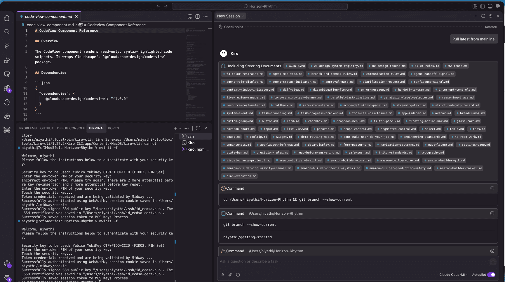
Designing in Kiro, a conversation-driven build with Cloudscape components in the repo

Sometimes Kiro genuinely wows me, inferring an interaction model I hadn't articulated, suggesting component compositions better than what I'd have drawn. Other times it loses context mid-conversation, lags until I restart, or generates specs that subtly violate spacing tokens and look right but aren't. My workaround: save key decisions as markdown snippets in steering, so even when context is lost, the decisions persist. The output lives in the repo with exact component names engineers can search.

The real shift: I think in conversation now, not in pixels. Understanding the material before shaping it makes the design better upstream.
Deep dive

Deep Dive

01The landing page

If the system knows there are 5 incidents and one is critical, showing a neutral dashboard is negligent design.

The expectation was to design a CloudWatch homepage: a neutral overview showing system-health metrics, recent dashboards, and a getting-started checklist. The classic monitoring landing page. I argued this was wrong. If the system already knows what's broken, the first thing a user sees should be the most important thing happening right now, not a neutral summary they have to decode.

The first iteration was a carousel of incident cards, each card representing one issue, swipeable by priority. It worked conceptually but hit a scalability wall. You can't scroll through 30 cards and still feel oriented. Priority gets lost in volume.

The iteration that landed, an AI-generated briefing paired with a prioritized feed of incident cards ranked by severity.

The iteration that landed: an AI-generated briefing that summarizes the situation in natural language (“4 things need your attention this morning, the checkout flow is the most urgent”) paired with a prioritized feed of incident cards ranked by severity. The system triages, tells you what matters most in plain language, and gives you the ranked list to act on. No scanning. No decoding. The landing page has an opinion, it tells you where to start.

02The application map

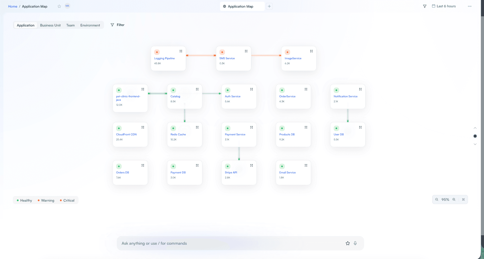
At agent-scale, the primary mental model is topology, how services connect, where health degrades, what the blast radius looks like. Not metrics. Not logs. The map.

What I designed, a spatial service map where:

  • Nodes follow a consistent card pattern: status dot + service name + request volume (45.8K) + expand affordance.
  • Arrows show dependency direction and carry health color, red paths show propagation, green shows healthy flow.
  • Four filter dimensions (Application / Business Unit / Team / Environment) let the same infrastructure be viewed through different lenses depending on who's looking, an SRE sees by environment, a VP sees by business unit.
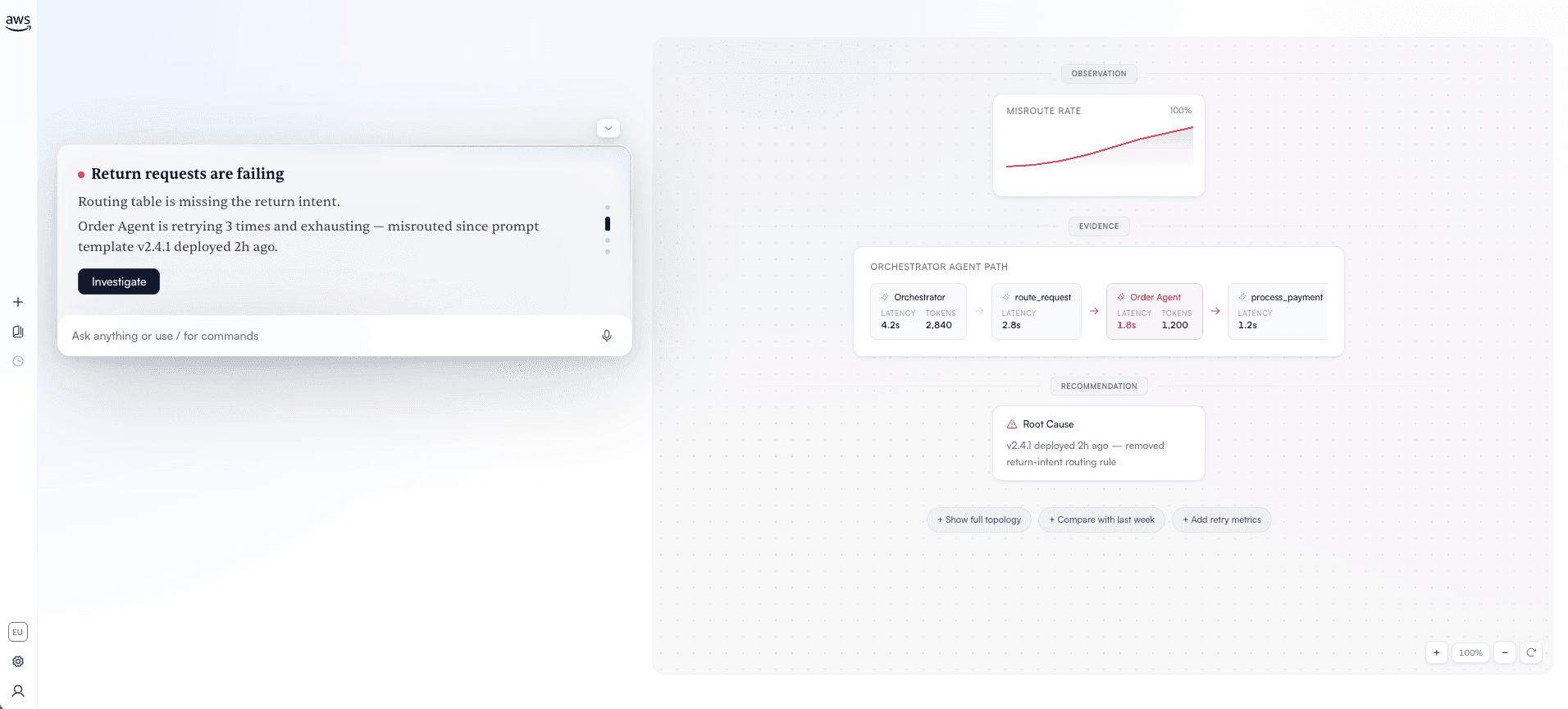
  • The AI surfaces root cause beneath the map in plain language, not “threshold breached” but a narrative: what broke, when, what correlates, and what changed.
Application Map showing service topology with health overlays and dependency arrows

Application Map, service topology with health overlays, dependency arrows, and four filter dimensions (Application / Business Unit / Team / Environment).

AI investigation surfacing root cause with observation, evidence, and recommendation

The AI surfaces root cause in plain language, observation, evidence, and a narrative of what broke, when, and what changed.

03Query to dashboard

Design decision

A query built during an incident should become a dashboard widget with one action. Dashboards shouldn't be pre-built templates, they should emerge from real investigations.

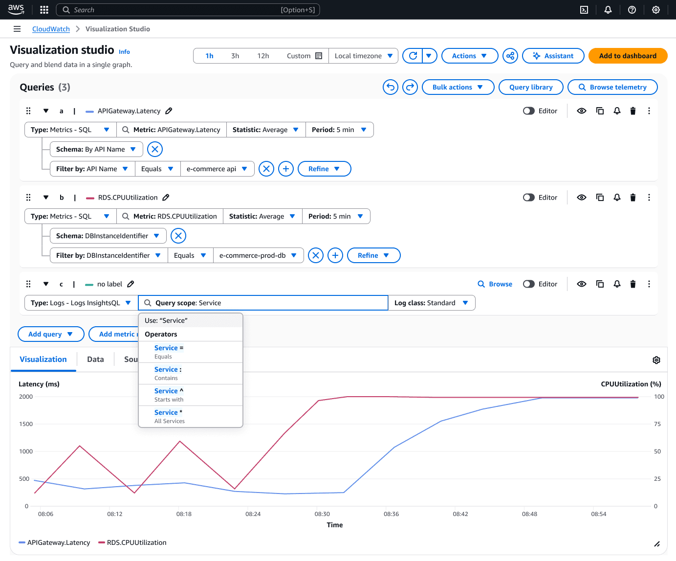
In CloudWatch, the querying experience is fragmented, finding, building, and editing a query are split across separate tabs. Users would find a metric namespace, switch tabs to build a query, switch again to edit it, then lose the context of what they were originally investigating.

Solution: a single widget that can create a query and translate it into a graph. Editing and finding related metrics are aligned to the current user behaviour. Users can construct the query visually with or without SQL, and chat lets them describe what they want in natural language.

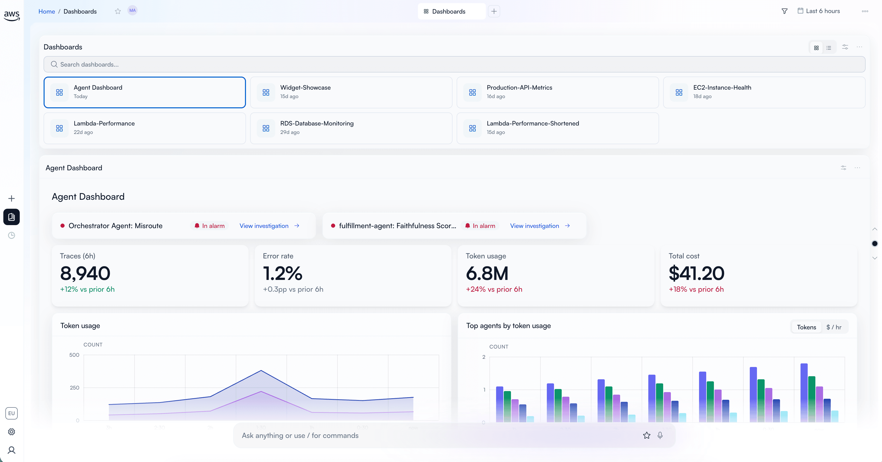
A query built during an incident promoted into a dashboard widget

A query built during an incident becomes a dashboard widget with one action.

04Getting started

If the product can't demonstrate its value in the first 30 seconds without a tutorial, the product is wrong, not the onboarding.

Quick Launch, users land directly in CloudWatch Plus with services auto-detected, no wizard.

Design decision: Quick Launch with default configuration. Users land directly on CloudWatch Plus, no workflow, and services are auto-detected, not manually configured. Getting Started mimics the landing page so users feel they're already in the product, not a tutorial. I introduced “Try with sample data” so users can experience the product even when no data is configured. Everything removed from onboarding remains accessible in Settings.

Business impact

What changed

The project delivered measurable improvements across several key performance metrics.

Usability signal

In moderated sessions, users with the minimal onboarding reached their first meaningful interaction (viewing an incident or running a query) in under 2 minutes. The previous wizard-based flow averaged 8+ minutes before users saw real product value. (Qualitative, 6 participants, internal.)

Topology comprehension

In a comparative walkthrough, participants identified blast radius, which services are affected by a failure, 4x faster with the colored-arrow topology map than with a traditional service list with status badges.

Visualization Studio consolidation

Task completion for “find a metric, build a query, save to dashboard” went from 3 context-switches (old tab-based design) to 0. A single-surface flow.

Competitive positioning

The landing page's proactive briefing pattern has no direct equivalent in Google Agent Observability or Grafana Cloud, both still lead with dashboards or trace views, not AI-generated incident prioritization.

~70%
MTTR reduction
4x
Faster blast-radius identification
0
Context switches for query-to-dashboard flow