Thinking Hats Landscape Studio
View site- Year
- Role
A cinematic, motion-rich portfolio for an award-winning landscape architecture studio, from art direction and interface design to the production build.
A cinematic, motion-rich portfolio for an award-winning landscape architecture studio, from art direction and interface design to the production build.
The Challenge
Thinking Hats designs landscapes that respond to terrain, climate, and memory. Their website flattened all of that into a generic template.
Founded in 2017 in Calicut, Thinking Hats is an award-winning, research-driven practice working across residential, institutional, and public landscapes. But the existing site read like a brochure, static, templated, and thin on the photography and craft the studio is known for.
For a studio, the website is a pitch. Every visitor is a potential client, and the single outcome that matters is a conversation started. So the design had two jobs at once: convey the practice's sensibility through image, colour, and pace, and make reaching out feel effortless from anywhere on the site.
The task wasn't to decorate a website. It was to make the web experience feel as considered as the gardens, and turn that feeling into a conversation.
My role
A solo, end-to-end engagement, from art direction and interaction design through to shipping the production build on Vercel.
What I did
The Website
Every design choice was made to do one of two things: make the studio's sensibility felt, or make getting in touch effortless. Then it all had to run at 60fps on a photography-heavy site. Design and build kept informing each other.
01Design language
Colour, type, and imagery, all drawn from the landscape.
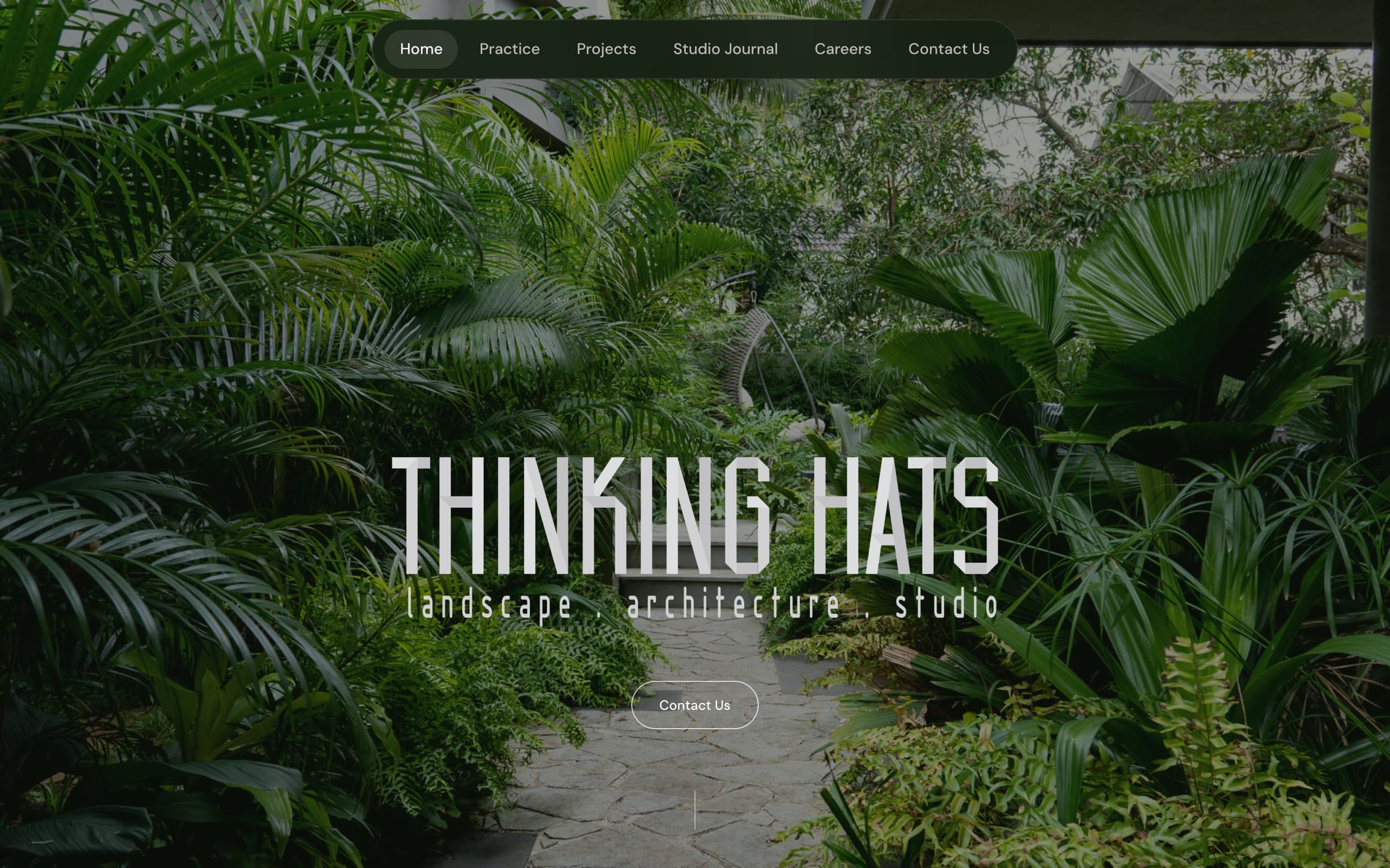
The palette comes straight from the studio's world: forest greens paired with warm sand tones, the colours of canopy and earth. It grounds the site in landscape before a single word is read, and gives the whole experience a calm, natural register rather than a corporate one.
Typography splits the work in two. An editorial serif carries titles and pull statements, lending the gravitas of a print monograph, while a clean sans keeps body copy quiet and legible. Above all, photography leads: full-bleed images, generous negative space, and rounded frames treat every project as the hero it is.
Design decision
Let the photography lead. Chrome stays minimal, type gets out of the way, and the imagery, which is the studio's real product, is given room to breathe on every page.
Forest greens, sand tones, and a full-bleed hero, the palette drawn from the landscape itself.
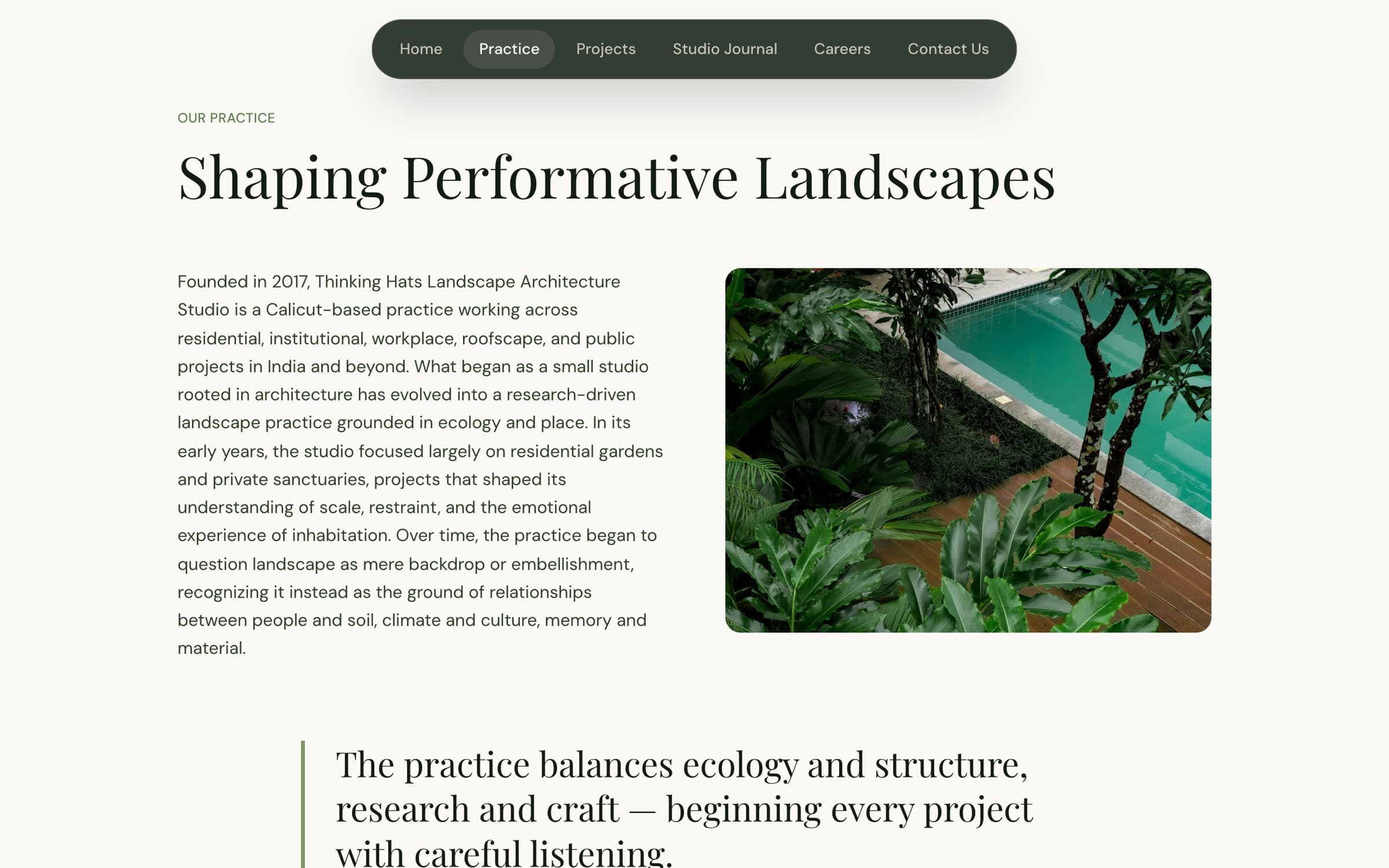
Editorial serif for statements, a quiet sans for reading, imagery never far away.
02A cinematic scroll
Every section is paced like its own scene.
The homepage is composed as a single cinematic scroll, each section paced like a scene. A full-screen hero carousel opens the studio, then the page hands off to a scroll-driven horizontal gallery of selected work, a full-width video moment, an awards grid, and a video-background footer.
The variety is deliberate. Reusing the same layout for every band would flatten the story, so each section earns a distinct rhythm, horizontal glide for the work, a still cinematic pause for video, a denser bento for awards, so the scroll feels curated rather than templated.
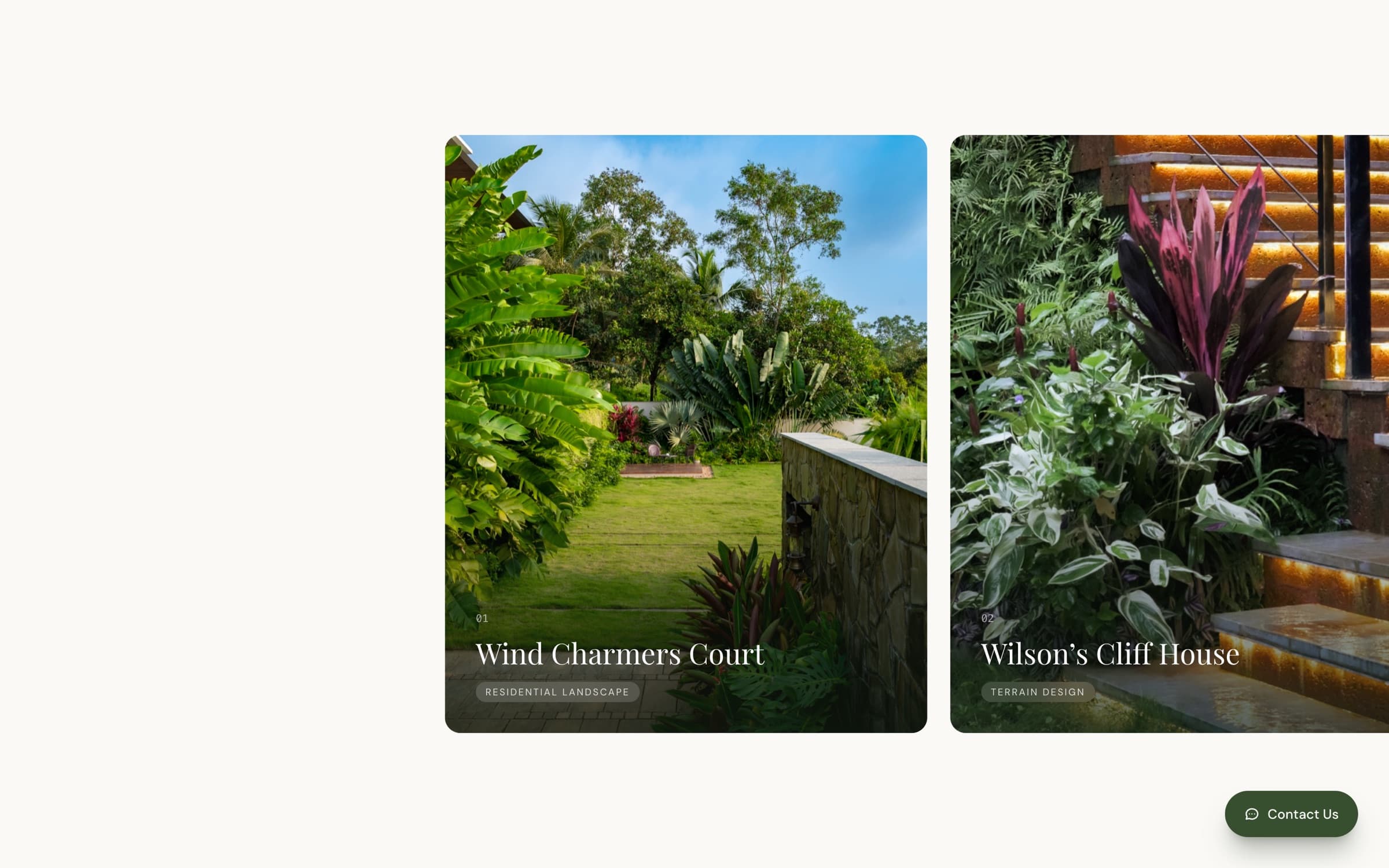
Selected work, a horizontal gallery driven by vertical scroll.
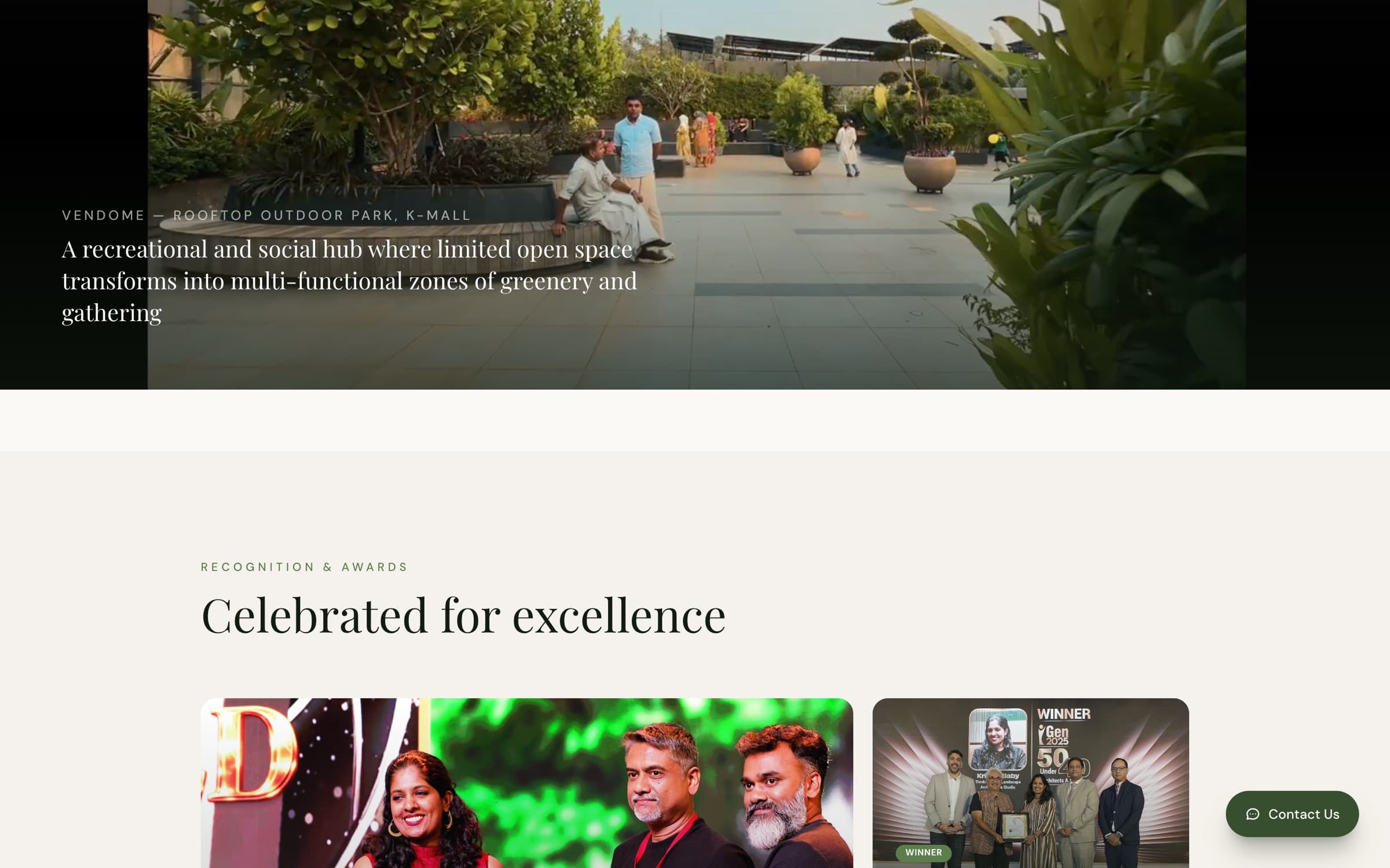
Awards, a denser bento grid so it reads differently from the sections around it.
03Built to show the work
A small publishing system, so the studio keeps telling its story.
Beyond the homepage, the site is a small publishing system. Fourteen projects and six studio-journal articles are each driven by typed content models, so the studio can add new work without touching layout code, and every page stays visually consistent.
Project pages open on an editorial title, run full-width video and a pull quote, then flow into a masonry gallery where the photography takes over. Journal articles compose from a set of content blocks, paragraphs, pull quotes, image pairs, masonry grids, author asides, and embedded PDFs, so long-form stories stay as considered as the projects.
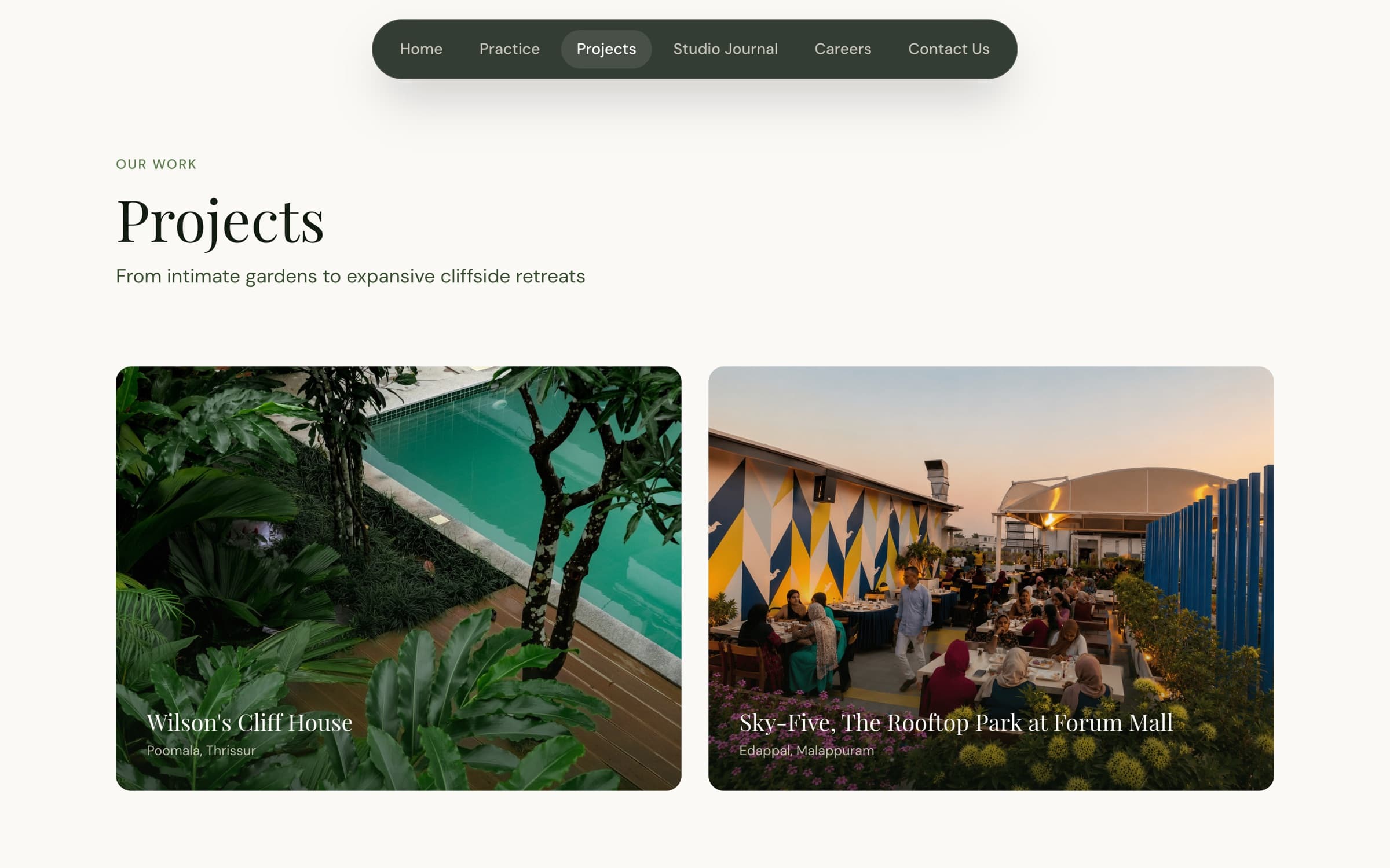
Projects listing, 14 works across diverse typologies.
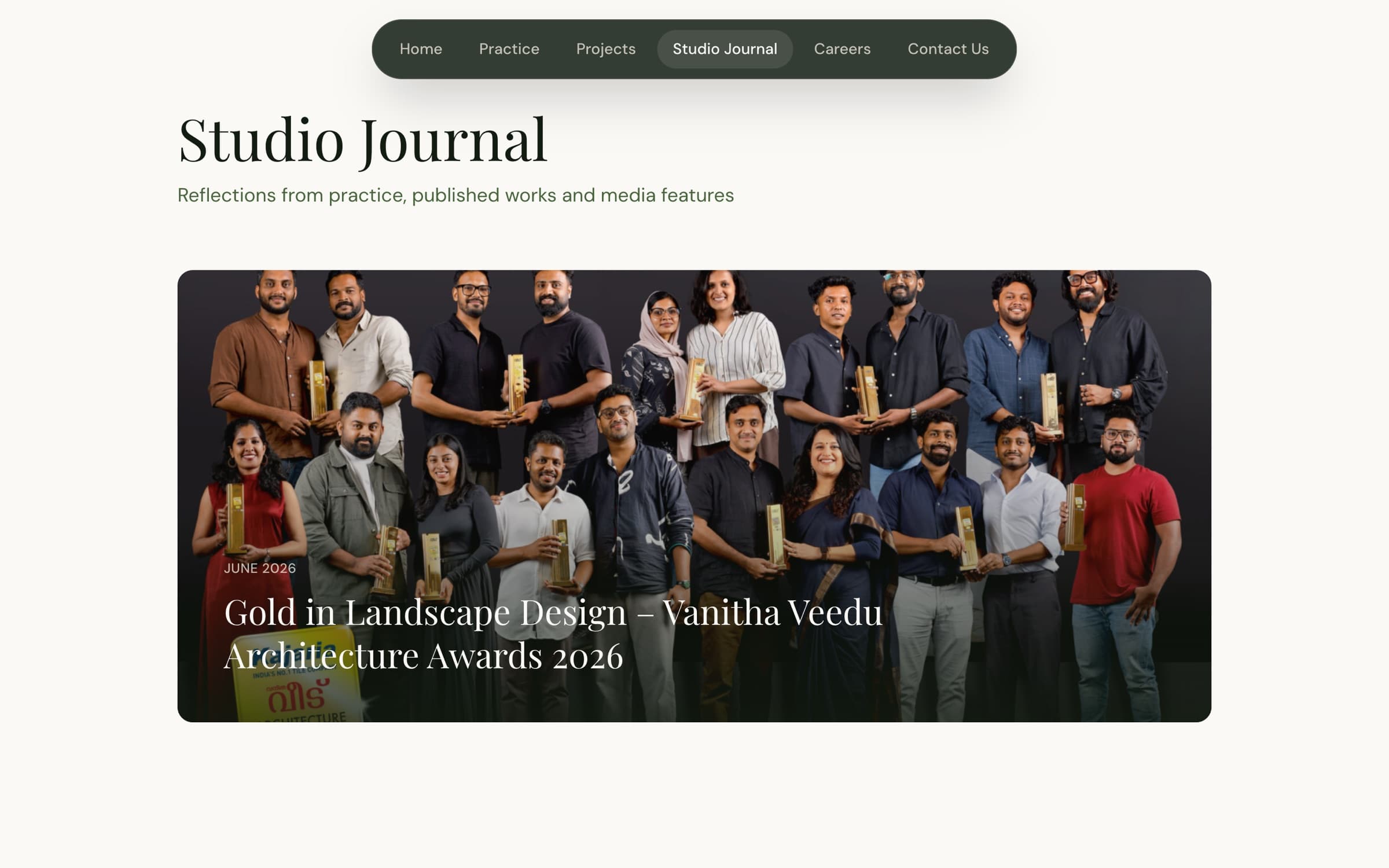
Studio Journal, a featured hero above alternating cards.
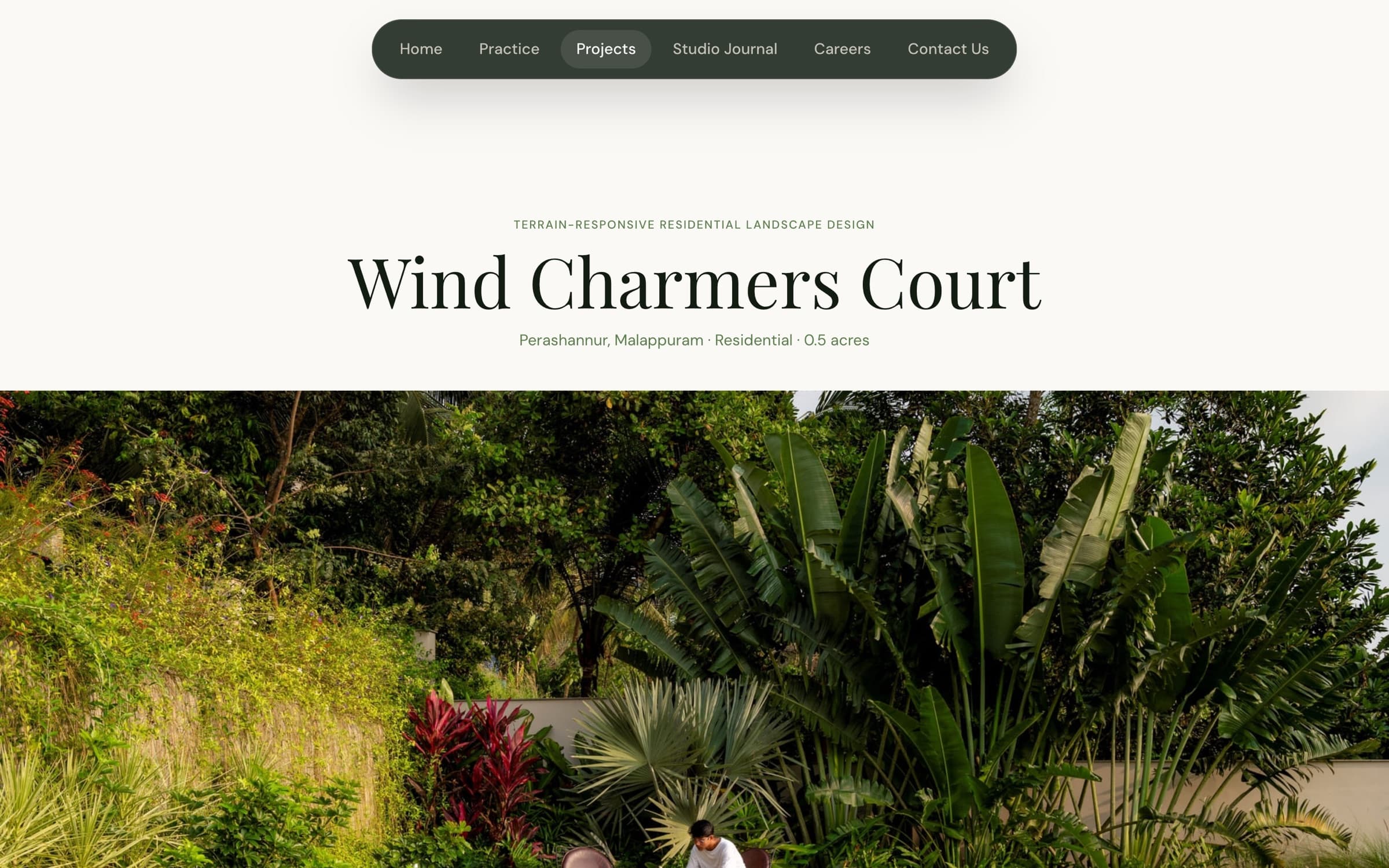
A project detail page: editorial title, then the imagery takes over.
04Contact, always within reach
An inquiry is the whole point, so it is never more than a glance away.
Because an inquiry is the site's real output, contact is never more than a glance away. A floating Contact button rides along on every page, appearing once the hero scrolls past and tucking away only at the footer so it never covers it. The homepage then closes on a full video-background call to action, ending the scroll on the one action that matters.
Reaching out opens a modal in place rather than routing to a separate page, so a visitor moved by a project can act on that feeling without losing it. The intent is gentle but constant: wherever attention lands, the next step is obvious.
Design decision
Make contact ambient. A persistent floating button plus a closing CTA means the primary goal, starting a conversation, is reachable from any scroll position without ever nagging the visitor.
05Motion & performance
A photography-forward site lives or dies on how it moves.
A photography-forward site lives or dies on how it moves. The scroll-driven horizontal gallery had persistent jitter, so I chased it through the usual suspects, disabling Lenis, wrapping the value in a spring, reading layout every frame, before finding the real cause.
The gallery images were 15–18MB each. Six of them meant ~75MB of textures being GPU-composited on every frame of the transform. No amount of code could fix that.
Design decision
Compressed the gallery from ~75MB to 3.6MB with sips, resized to 1600px at 75% quality, and let Lenis feed smooth scroll input straight into Framer Motion. The jitter disappeared.
Image weight, not code, is the number one performance killer for scroll animations.
Responsive by default
The whole site was built mobile-first, so the desktop experience folds down to the phone without losing its character.
Every layout is fluid: the type scale, spacing, and grid all respond to the viewport, so nothing is a shrunken desktop page. The floating pill nav collapses into a full-screen overlay menu, the scroll-driven galleries re-flow into single-column stacks, and full-bleed photography keeps its impact on a narrow screen.
The same smooth scroll and reveal motion run on touch devices, and the persistent Contact button stays within thumb reach the whole way down, so reaching out is just as effortless on a phone as on a desktop.
Outcomes & impact
Cinematic, motion-rich, and grounded in the studio's own palette, it reads as a considered design object rather than a template.
A persistent floating button and a closing CTA keep the primary goal, starting a conversation, one glance away from any scroll position.
Fourteen project pages and six journal articles, each driven by typed content models so the studio can keep publishing without touching layout code.
A photography-heavy site that still scrolls smoothly, once image weight rather than code was treated as the real constraint. Live on Vercel with auto-deploy.
Reflections & learnings
The strongest design decisions were about restraint, letting colour, imagery, and pace carry the practice's sensibility, and making the one action that matters, getting in touch, effortless from anywhere.
I refactored animation logic for hours before profiling revealed the real cost was 75MB of uncompressed textures. Measure before you optimize, the fix was upstream of the code the whole time.
The most effective change was removing motion, not adding it. Every scroll-linked transform costs GPU work, so each one has to justify itself, and Lenis and Framer Motion cooperate once you stop fighting them.
Designing and building it myself meant every craft decision was also a performance decision.