Amazon Device exchange
- Year
- Role
Turning a crowded exchange form into a guided desktop purchase experience.

Turning a crowded exchange form into a guided desktop purchase experience.
The opportunity
Customers wanted the value of exchanging an old product, but the desktop experience made the offer difficult to understand and easy to abandon.
The workflow lived inside the Amazon product-page buy box, where product selection, eligibility rules, price breakdowns, warnings and calls to action competed for limited space.
This was especially costly for phones and large appliances, where customers needed to identify an existing product, understand its required condition and feel confident that the promised discount would survive pickup.
The design goal was to reduce purchase-page noise while giving exchange decisions the space and evidence they needed.
My role
I reframed the desktop exchange journey, synthesised field insights, reorganised the information architecture and designed the interaction from product-page entry through device verification and confirmed value.
What I did
Where the experience broke
On desktop, the entire exchange workflow had been compressed into the buy box. Product details, form fields, conditions, discounts and warnings all competed inside the narrowest part of the page.
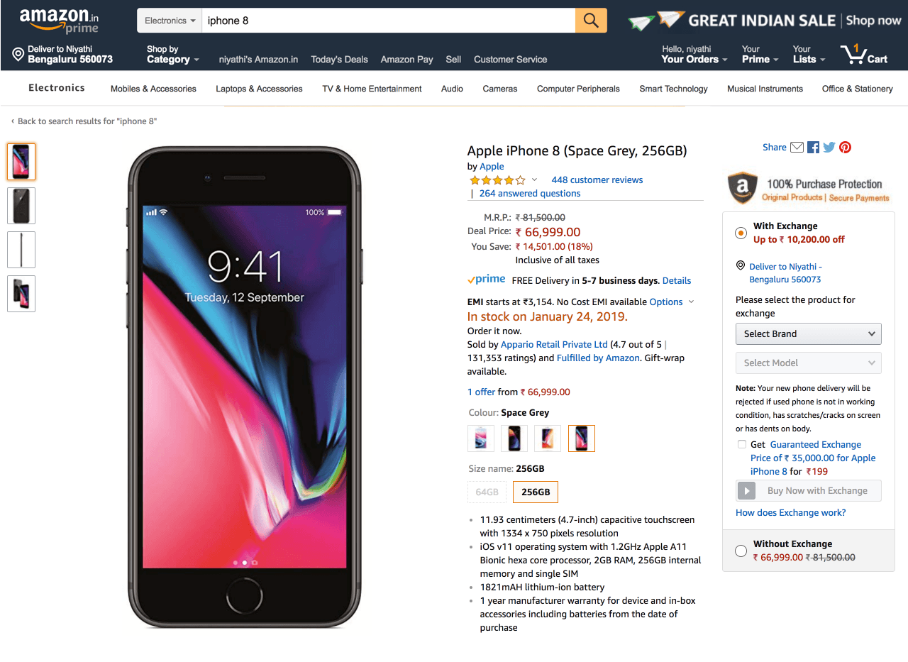
Selection, eligibility and pricing were squeezed into one narrow column.
Vague conditions left customers unsure whether their device would be accepted.
Offer price, service fees and extra discounts made the final benefit difficult to trust.
Research insight
Field research showed that large-appliance purchases in Indian homes were often shared decisions. Desktop supported comparison and family discussion, so the exchange flow needed to work as a considered purchase journey rather than a secondary utility.

The redesign
The redesign separated exchange from shopping without disconnecting the two. The product page introduced the offer; the modal handled eligibility, evidence and valuation in a deliberate sequence.
The product page became a clear entry point rather than a cramped form. A dedicated modal created enough room to explain the service, identify the old device and preserve focus on the purchase.
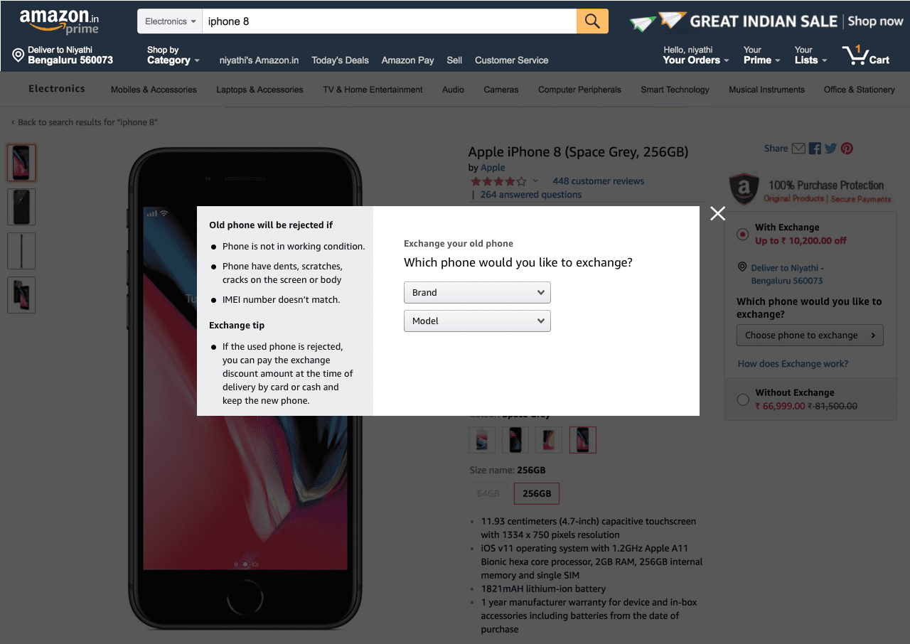
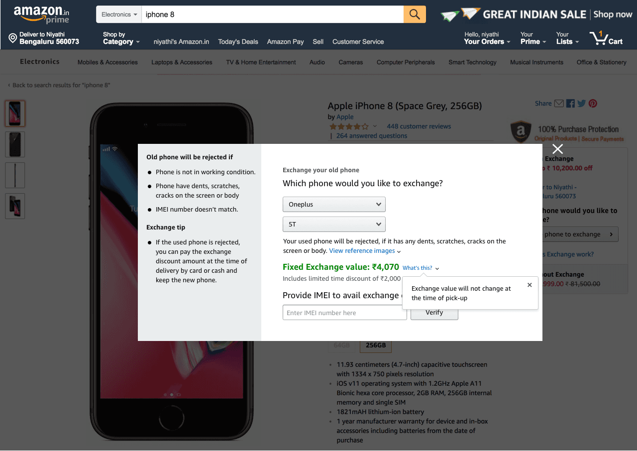
Critical rejection criteria moved into a persistent left-hand guidance panel. Customers could understand working-condition requirements while completing the exchange rather than discovering them at delivery.
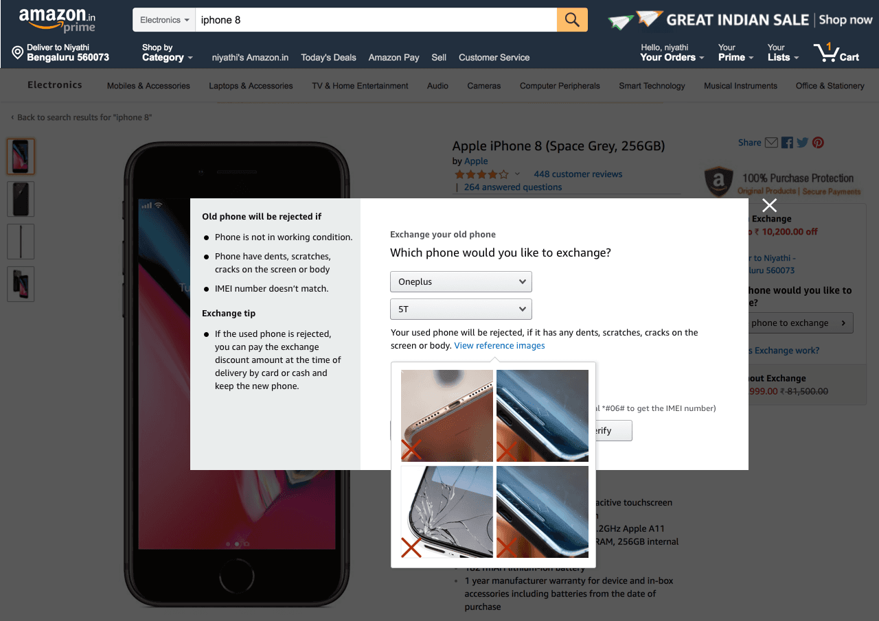
The offer became a fixed exchange value, with the promotional amount separated as a limited-time discount. Clear language explained that the confirmed value would not change at pickup.
Final desktop experience
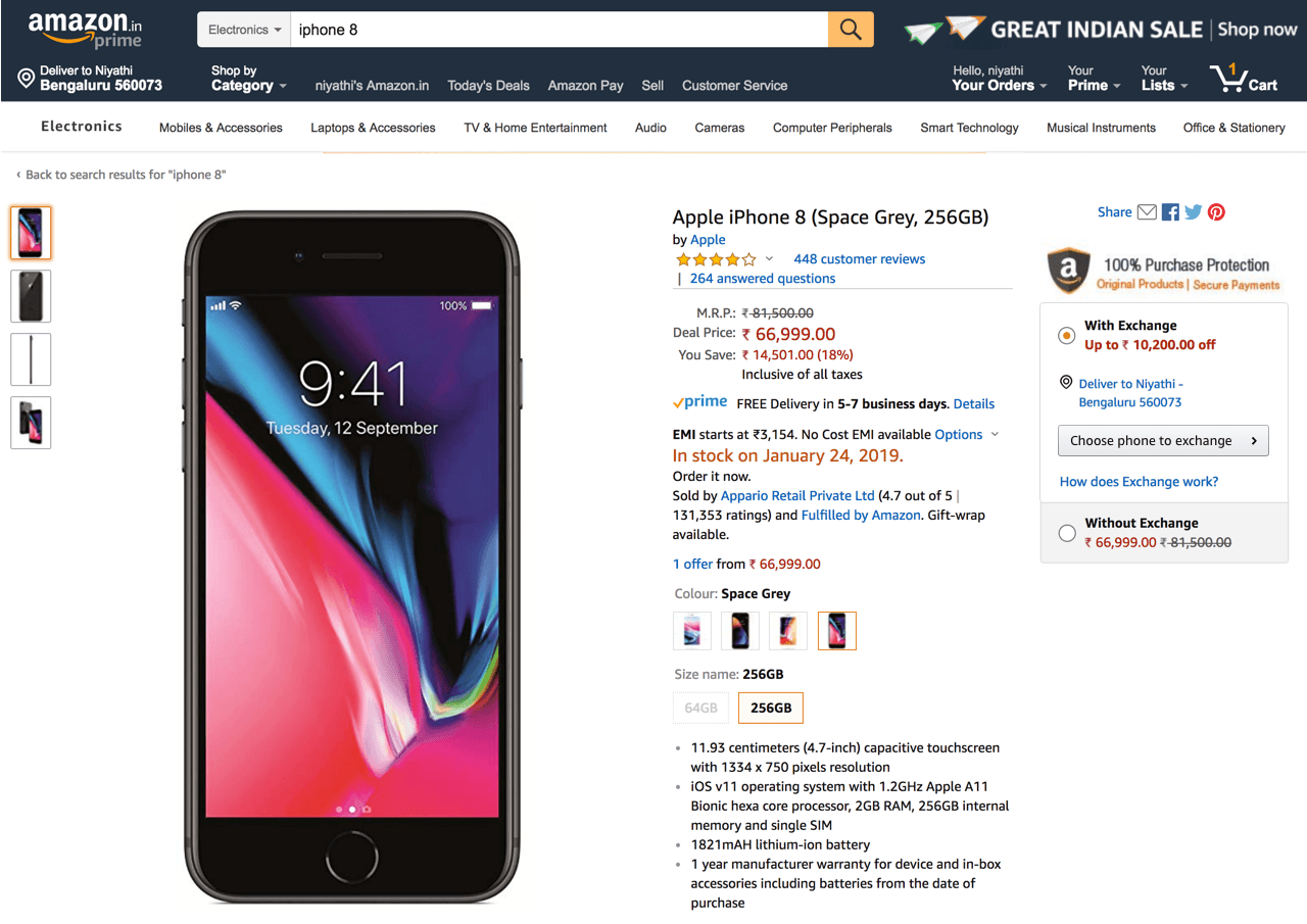
The final product page keeps the exchange proposition visible while reducing the buy box to one clear action. Detailed questions and conditions appear only after the customer chooses to continue.
Measured impact
Moving the exchange workflow into a dedicated, guided experience helped more desktop customers complete the purchase and reduced downstream failures at pickup.
The product page retained a concise exchange proposition and one clear next action.
Eligibility rules and visual condition examples appeared before customers committed.
Fixed-value language and a separated promotional discount made the benefit easier to trust.
Design principles
The buy box should communicate value and intent; detailed exchange work deserves a focused surface.
Clear criteria and reference images are more useful than warnings customers encounter at pickup.
A benefit becomes credible when the interface distinguishes guaranteed value from temporary promotion.
A simpler product page created room for a more complete exchange decision.